,
12 tweets,
4 min read
Read on Twitter
Apple Watch interfaces are fascinating. They are a very delicate exercise of showing only the most important thing to the right person at the right time (and nothing else).
Let's see some examples.
Let's see some examples.
2/ here is my apple watch main screen. I have chosen it very specifically to show me things that matter to me at all times. Yet there are still many failures here. 

To the top left is streaks, a habit building app. The main screen looks like this -
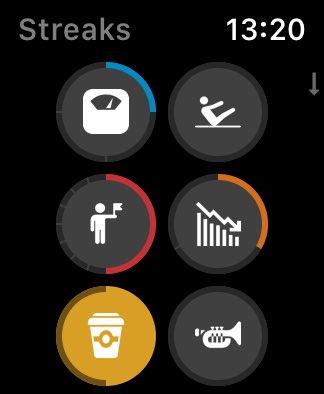
4/ I chose the colors deliberately so that they would change colour on the main screen (which would be fun and add variety and precision about which icon I am seeing). Yet somehow, no matter the habit, the main icon circle remains grey. Why? As far as I can tell, no reason at all
5/ also, maddeningly, you cannot change the order in which the icons appear on the main watch face, and the app decision process for this is completely opaque
CC @TheStreaksApp
CC @TheStreaksApp
6/ now let's look at activity, a default app that comes with Apple watch. There is no way to change the icon you see here, even if you care more about steps, say, and nothing about standing up.
But the Apple one is the best of the bunch (and these are the best complications)!
But the Apple one is the best of the bunch (and these are the best complications)!
7/ returning to the main screen again, the central bottom complication is Lose It, probably the best of the Apple Watch diet apps

This circle is the only face you can choose - calories consumed so far / calories remaining for the day. That's it. No other options.
And ironically, there are so few apps that do complications well that, despite this being pretty useless to me, I still have it on my main face.
And ironically, there are so few apps that do complications well that, despite this being pretty useless to me, I still have it on my main face.
The final one on my watch is the mighty @CARROT_app weather app. Btw I should mention I'm a pro user at all of these.
Carrot actually does this the best. Here is the set of options you can get for the watch face. It's very impressive and is exactly what one needs.
Carrot actually does this the best. Here is the set of options you can get for the watch face. It's very impressive and is exactly what one needs.
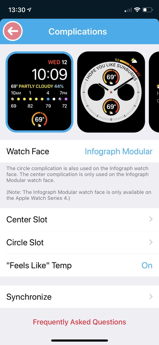
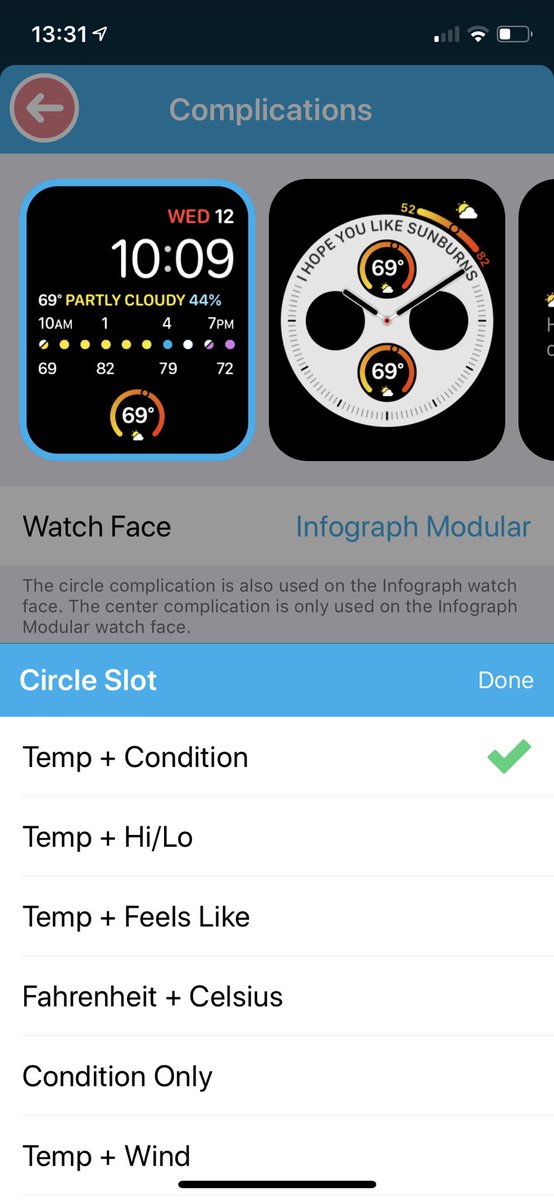
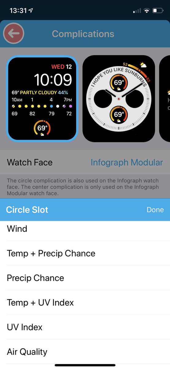
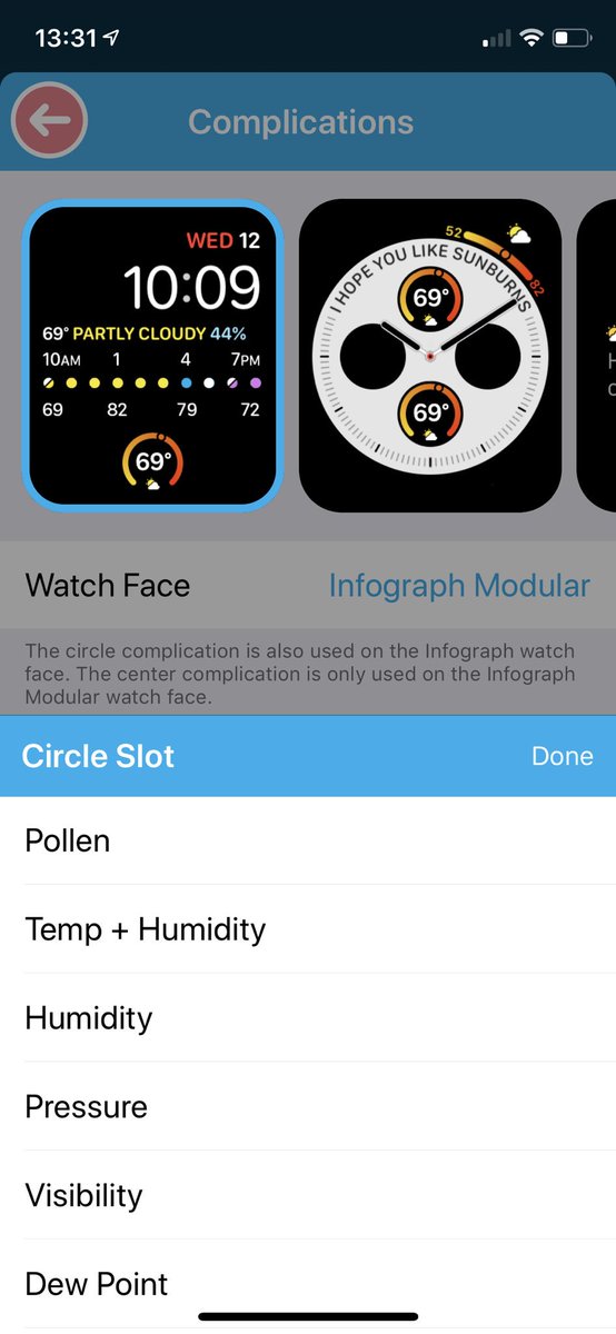
Yet amazingly, Carrot still doesn't give me PRECISELY what I want - which is "feels like" in the centre and condition at the bottom
11/ to conclude, you'll note how subtle it is to get this right and wrong - it's little shifts that make this succeed or fail.
So there are two options, and both are hard!
A) design every interface
B) let "AI" decide
Neither is optimal.
So there are two options, and both are hard!
A) design every interface
B) let "AI" decide
Neither is optimal.
12/ so truly, I think watch complications are going to be bad for a very long time. Yet they've come far since Apple Watch 1. Hopefully, one day, we really will get a face we can care about and 100% showing us what we need..but it'll be a while