,
25 tweets,
6 min read
Read on Twitter
Seems like people interpreted my last tweet about this as being negative or inferring that I thought the update is bad. What I really meant though, was that I literally have questions about this. Here are my questions so far: 

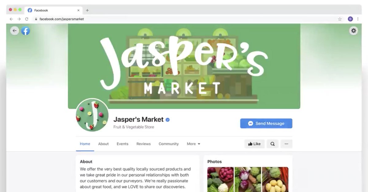
The top blue bar identified Facebook for years.
The new top nav is white, and seems to get lost in the rest of the UI.
Why did they drop the blue bar?
One of these images is *clearly* FB. The other image could be anything else.
The new top nav is white, and seems to get lost in the rest of the UI.
Why did they drop the blue bar?
One of these images is *clearly* FB. The other image could be anything else.


Does visual recognizability matter when you're as big as Facebook?
As startups you generally want to do *something* to stand out in the sea of apps and websites, but maybe there's a point where it just literally doesn't matter if the UI is white, light gray, and startup-blue.
As startups you generally want to do *something* to stand out in the sea of apps and websites, but maybe there's a point where it just literally doesn't matter if the UI is white, light gray, and startup-blue.
Facebook *owned* this color. It's now entirely gone. I wonder how they're going to handle the rollout of updated brand materials around the world. Think: every logo every company has ever used to link to Facebook, ever, now needs an update.

We've been seeing a trend of mobile apps dropping text labels from tab bars for the last few years. Twitter has leaned into it on desktop as well with their refresh, and now Facebook.
Are these apps just big enough to get away with icon-only primary nav? Or is this less usable?
Are these apps just big enough to get away with icon-only primary nav? Or is this less usable?
What does 'create' in the left sidebar do? It doesn't seem like it could possibly be related to child elements like 'Memories'.
Will people really be curious enough to click that vague button?
Will people really be curious enough to click that vague button?
In the screenshot there is a blurry ( + ) icon on top of the 'Add to story' card. How are they going to achieve that blur across browsers? backdrop-filter doesn't have great browser support, so I wonder if they figured out something custom.
FB + Messenger on dot com has always had a weird relationship. On the current website, the Messenger icon opens a dropdown. Will it do the same thing in the redesign? Or will it behave consistently with the other nav tabs and show a full Messenger experience in the app body?
There are three ways to enter/explore groups in this screenshot: left column list items, primary navigation tab, and the right column upsell. Why is this all so spread out?
In the contacts column you can see avatars with either a blue outline, a gray outline, or no outline at all. What does each mean? I would have assumed blue outline = has stories, gray outline = has no stories, no outline = ...?
There is a navbar cog icon and a 'settings and privacy' list item in the left column to view settings. Do these do the same thing? If so, why are there two entry points? If not, will it be confusing how to separate the two functions if the icon is the same?
I've never seen an app put the current user's profile photo intermingled with primary nav elements. Usually it's off to the opposite side of the page (Twitter) or at the end of primary nav list. Why did it end up in the middle?
Facebook has a bajillion sub-apps. Will the top navigation be dynamic based upon which sub-apps you use most often? Eg. could marketplace in the top nav be replaced with events?
Will the right 'contacts' column be collapsible, like in the current dot com experience?
How did the team make the decision to prioritize stories over feed content? Seems like feed content is how FB makes most of its money, and therefore it'd be better to prioritize peeking feed content to draw people in. Are stories the long-term monetization game now?
Will this be responsive? I think Twitter knocked it out of the park with their responsive web experience; I wonder if FB prioritized this as well. Mobile web has always been super rough at FB, but has tons of usage in developing markets - will they be able to unify their stack?
A lot of people asked this, but it seems like a valid question: where will the current sidebar ads go? If there is no more sidebar real estate for ads, will this have a meaningful impact on the bottom line?
The stories UI has become pretty standardized at this point, but I wonder how it will work when you have friends with super long names. Will they get truncated? Wrapped? What if they aren't professional photographers that look beautiful? (jk)
The current Facebook right sidebar is used as a "catch all" for housing random components: today's birthdays, the performance of ads you're running, new updates on the pages you manage, upcoming events, etc etc. Where will all of these go?
Are we going to lose the bottom-pinned Messenger windows? I didn't see any in the FB announcement, but those seem super valuable in today's experience.
In the marketing video, we see that the global search input gets minimized on certain views, and replaced by a scoped search in the left sidebar.
Today the navbar search is *always* expanded and gets scoped as you navigate the app.
Will this be confusing to users?
Today the navbar search is *always* expanded and gets scoped as you navigate the app.
Will this be confusing to users?

On profile views, search is removed from the header entirely and becomes a small icon in the Page nav. What kind of impact will breaking apart search like this have on metrics and usability? It seems more intuitive to stick with a single global input - what am I missing?
In this part of the marketing video it doesn't appear that there's a notifications dropdown anymore. Instead you go straight to a notifications view where the left column becomes a list of recent notifs.
I wonder what the impact will be of not being able to "peek" notifs anymore
I wonder what the impact will be of not being able to "peek" notifs anymore

That's it. In general I'm most excited to see:
- how fast it is
- if it's responsive
- how they handle Messenger
Otherwise, it seems like they have really pulled a lot of weight to bring so many views together from an IA perspective: pages, events, groups, and profiles.
- how fast it is
- if it's responsive
- how they handle Messenger
Otherwise, it seems like they have really pulled a lot of weight to bring so many views together from an IA perspective: pages, events, groups, and profiles.
We'll discuss this + more on @designdetailsfm too, I suppose!
As always, we're just getting a tiny peek of marketing materials. We'll have to wait and see what questions get answered and what new ones pop up once we actually play with the changes in prod.
As always, we're just getting a tiny peek of marketing materials. We'll have to wait and see what questions get answered and what new ones pop up once we actually play with the changes in prod.