,
24 tweets,
12 min read
Read on Twitter
1/thread
After seeing @michaelbierut's post uncovering the name of the gorgeous typeface (Журнальная рубленая / Zhurnalnaya Roublennaya / Magazine Sans) used in @HBO #Chernobyl, I was inspired to do a deeper dive into Soviet typography.
After seeing @michaelbierut's post uncovering the name of the gorgeous typeface (Журнальная рубленая / Zhurnalnaya Roublennaya / Magazine Sans) used in @HBO #Chernobyl, I was inspired to do a deeper dive into Soviet typography.
2/
The story of Zhurnalnaya itself is pretty interesting. Released in the 60s, it took inspiration from 30s typefaces like Erbar-Grotesk and Berhtold-Grotesk. Aside from #HBOChernobyl's custom cut, it has also been resurrected by @grillitype as GT Eesti.
fontsinuse.com/uses/12774/zhu…
The story of Zhurnalnaya itself is pretty interesting. Released in the 60s, it took inspiration from 30s typefaces like Erbar-Grotesk and Berhtold-Grotesk. Aside from #HBOChernobyl's custom cut, it has also been resurrected by @grillitype as GT Eesti.
fontsinuse.com/uses/12774/zhu…
3/
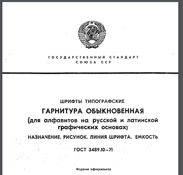
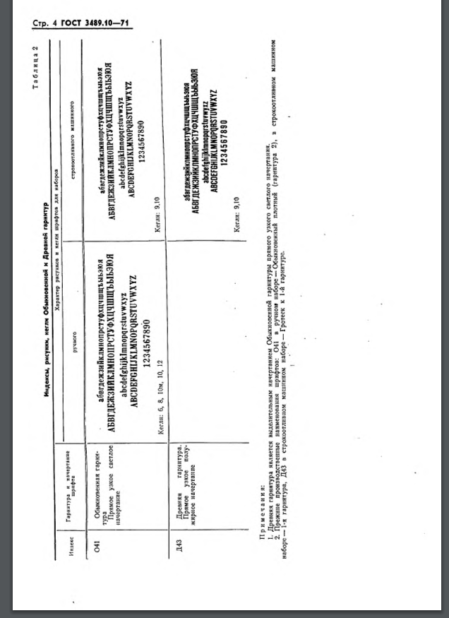
Contrary to popular belief, there was more than one typeface allowed in the USSR. There were actually 39, all conveniently documented in ГОСТ 3489 «Шрифты типографские» - Government Standard 3489 "Fonts, Typographical" - first set in 1946.
Contrary to popular belief, there was more than one typeface allowed in the USSR. There were actually 39, all conveniently documented in ГОСТ 3489 «Шрифты типографские» - Government Standard 3489 "Fonts, Typographical" - first set in 1946.
4/
ГОСТ 3489 replaced OST 1337 from 1932 (they started adding the G in the 40s). When OST 1337 was set, there was a large variety of type punches still left over from the Russian Empire. By the 40s and 50s, those punches had worn out, and new fonts had to be released.
ГОСТ 3489 replaced OST 1337 from 1932 (they started adding the G in the 40s). When OST 1337 was set, there was a large variety of type punches still left over from the Russian Empire. By the 40s and 50s, those punches had worn out, and new fonts had to be released.
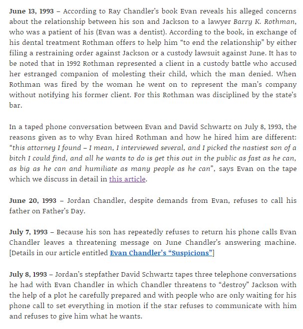
5/
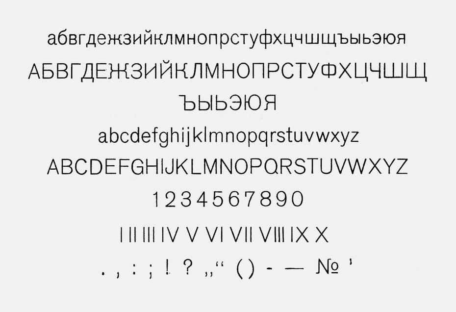
However, even before OST 1337 was set, a large amount of the pre-revolution typefaces were junked. OST 1337 contained just 31 cuts. Pictured below is a typeface creatively called "Regular", containing seven fonts.
However, even before OST 1337 was set, a large amount of the pre-revolution typefaces were junked. OST 1337 contained just 31 cuts. Pictured below is a typeface creatively called "Regular", containing seven fonts.


6/
Additional OST 1337 standard included Uchebnyi, Aldine, Latin (based on Berthold Latinisch). Latin would later become Literaturnaya, and be responsible for around 50% of all Soviet publication before being displaced by Times after the collapse of the Union.
Additional OST 1337 standard included Uchebnyi, Aldine, Latin (based on Berthold Latinisch). Latin would later become Literaturnaya, and be responsible for around 50% of all Soviet publication before being displaced by Times after the collapse of the Union.


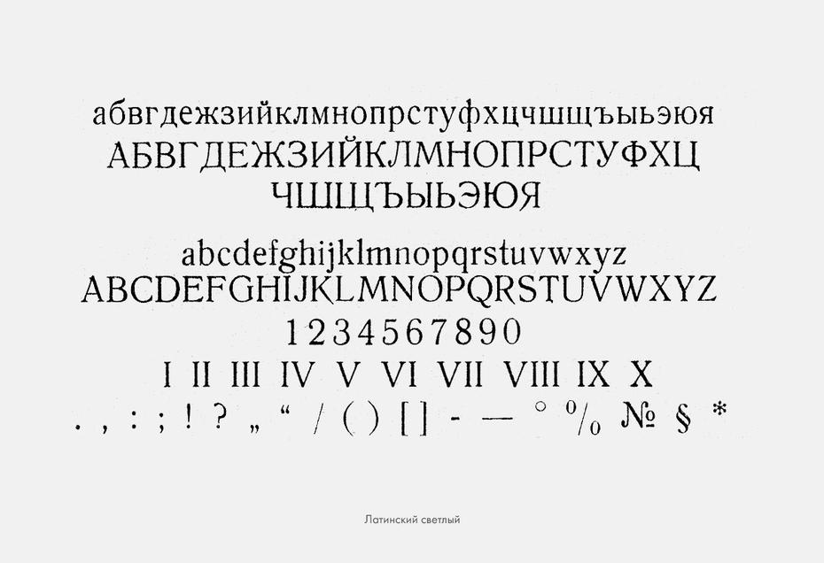
7/
Another one from OST 1337: Korinna, based on Berthold Korinna, I think it looks gorgeous, but one typographer of the time marked it as a candidate for removal because "the forms of а, б, ж, з, к, р, с and others are pretentious."
Another one from OST 1337: Korinna, based on Berthold Korinna, I think it looks gorgeous, but one typographer of the time marked it as a candidate for removal because "the forms of а, б, ж, з, к, р, с and others are pretentious."
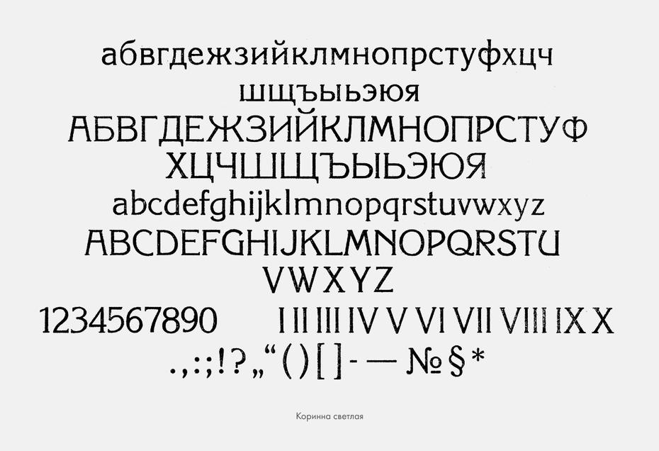

8/
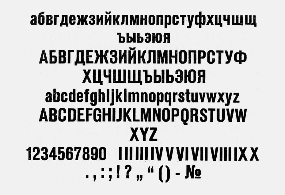
Some of the old typefaces were ruthlessly standardized. Pictured below is Berthold Akademisch and then the Academic that was included in OST 1337. A lot of its distinctiveness was wiped away, such as the italics-style t's (new style т, old style more like m)
Some of the old typefaces were ruthlessly standardized. Pictured below is Berthold Akademisch and then the Academic that was included in OST 1337. A lot of its distinctiveness was wiped away, such as the italics-style t's (new style т, old style more like m)

9/
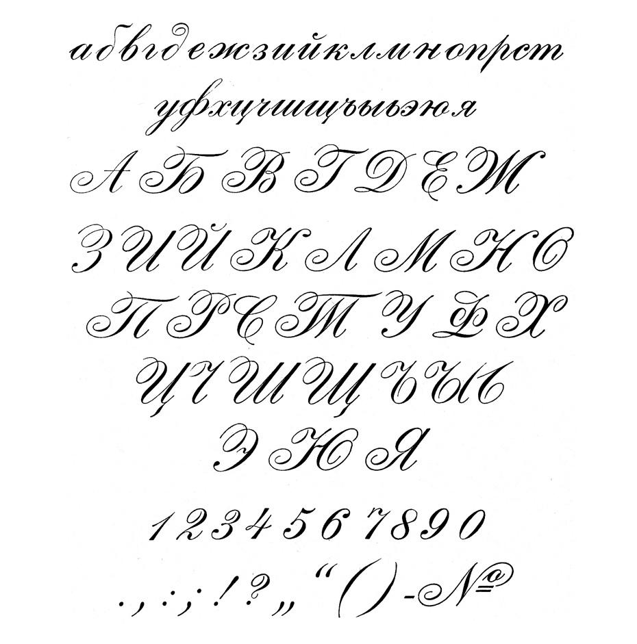
This one - Palmyra - was tested on Red Army soldiers in 1928, and was found to increase cognitive overhead by being both old-fashioned and too newfangled.
This one - Palmyra - was tested on Red Army soldiers in 1928, and was found to increase cognitive overhead by being both old-fashioned and too newfangled.

10/
Royal Grotesk and Akzidenz Grotesk were both included, and considered suitable for "readers of low qualification" due to their simplicity. Most children's books were set in Akzidenz. Today, Royal looks very odd to me, and definitely has that Zhurnalnaya "not quite right"ness
Royal Grotesk and Akzidenz Grotesk were both included, and considered suitable for "readers of low qualification" due to their simplicity. Most children's books were set in Akzidenz. Today, Royal looks very odd to me, and definitely has that Zhurnalnaya "not quite right"ness

11/
And before you think that it was all boring body copy typography, there were also some fun display ones.
And before you think that it was all boring body copy typography, there were also some fun display ones.

12/
Russian-speaking readers, and those who want to flip through more photos of the types, can do so here: typejournal.ru/articles/OST-1…
Russian-speaking readers, and those who want to flip through more photos of the types, can do so here: typejournal.ru/articles/OST-1…
13/
OST 1337 wasn't universal. Publication houses continued to use whatever they had lying around. But all the typographic movements of the 20s and 30s would meet the same fate that Russia's famous type foundries, like Lehmann's, did during WWI: converted for the war effort.
OST 1337 wasn't universal. Publication houses continued to use whatever they had lying around. But all the typographic movements of the 20s and 30s would meet the same fate that Russia's famous type foundries, like Lehmann's, did during WWI: converted for the war effort.
14/
Which brings us back to ГОСТ 3489. It was created right after the war, as industry was demobilizing and a large amount of resources and know-how were being brought in from Eastern Europe (especially East German steel and disassembled factories, but also Polish, Baltic, etc)
Which brings us back to ГОСТ 3489. It was created right after the war, as industry was demobilizing and a large amount of resources and know-how were being brought in from Eastern Europe (especially East German steel and disassembled factories, but also Polish, Baltic, etc)
15/
ГОСТ 3489 would also change over time, just like OST 1337. But a number of typefaces remained included, and coasted all the way through to 1991 and beyond. Елизаветинская / Yelezavetinskaya / Elizabeth is available from ParaType even today!
paratype.ru/fonts/pt/eliza…
ГОСТ 3489 would also change over time, just like OST 1337. But a number of typefaces remained included, and coasted all the way through to 1991 and beyond. Елизаветинская / Yelezavetinskaya / Elizabeth is available from ParaType even today!
paratype.ru/fonts/pt/eliza…

16/
"Regular" did well - it even got a new cut in "Regular New" which was intended to replace the old one but, well, you know how it goes when updating legacy standards. In place of Uchebnaya, we got Schkolnaya (serif, below) and Bukvarnaya (sans, link gostbank.metaltorg.ru/data/12599.pdf)
"Regular" did well - it even got a new cut in "Regular New" which was intended to replace the old one but, well, you know how it goes when updating legacy standards. In place of Uchebnaya, we got Schkolnaya (serif, below) and Bukvarnaya (sans, link gostbank.metaltorg.ru/data/12599.pdf)
17/
Surprisingly, Bodoni was quite popular throughout as well. Unlike the various Berthold/Russian Imperial types, it wasn't even renamed! It does have some very nice Cyrillic characters.
Surprisingly, Bodoni was quite popular throughout as well. Unlike the various Berthold/Russian Imperial types, it wasn't even renamed! It does have some very nice Cyrillic characters.
18/
We also start to see original typefaces appear as ГОСТ 3489 is revised. Bannikova was based on Petrine letterforms (yep, the same guy who instituted a beard tax and had a beard police also decided that all Russian typography had to be reformed, what a surprise).
We also start to see original typefaces appear as ГОСТ 3489 is revised. Bannikova was based on Petrine letterforms (yep, the same guy who instituted a beard tax and had a beard police also decided that all Russian typography had to be reformed, what a surprise).

19/
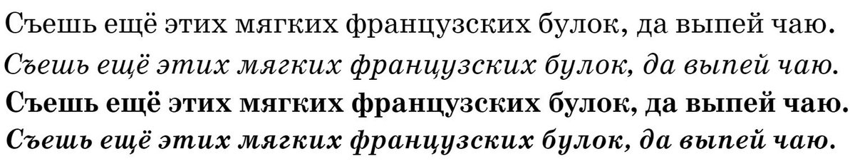
The pangram you see occasionally used throughout the samples (the Russian equivalent of the quick brown fox sentence) is "please eat more of these soft French buns and drink more tea" which is just delightful.
The pangram you see occasionally used throughout the samples (the Russian equivalent of the quick brown fox sentence) is "please eat more of these soft French buns and drink more tea" which is just delightful.
20/
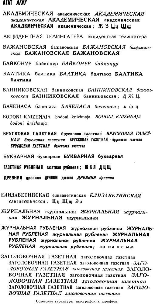
Fortunately, all ГОСТs are available in PDF online. Unfortunately, the scan quality tends to be atrocious, and some of them get OCR'ed, which makes them useless for our purposes. Below you can see a very okay quality list of available typefaces, WYSIWYG style.
Fortunately, all ГОСТs are available in PDF online. Unfortunately, the scan quality tends to be atrocious, and some of them get OCR'ed, which makes them useless for our purposes. Below you can see a very okay quality list of available typefaces, WYSIWYG style.


21/
Soviet typography was hardly the equivalent of the TV set with two channels. Designers wouldn't have access to the range of fonts the West did, but there were some of choices - and many of these typefaces were good enough to survive, at ParaType, GT, ITC, and other foundries
Soviet typography was hardly the equivalent of the TV set with two channels. Designers wouldn't have access to the range of fonts the West did, but there were some of choices - and many of these typefaces were good enough to survive, at ParaType, GT, ITC, and other foundries
22/
You can easily look the standards paperwork up yourselves by grabbing the codes off the Wikipedia page, Googling them, and then clicking on one of the totally legit Russian PDF hosting sites:
ru.wikipedia.org/wiki/%D0%93%D0…
You can easily look the standards paperwork up yourselves by grabbing the codes off the Wikipedia page, Googling them, and then clicking on one of the totally legit Russian PDF hosting sites:
ru.wikipedia.org/wiki/%D0%93%D0…
Just realized that GT Eesti has its own adorable website! It also goes into a bit of this history. gt-eesti.com
It's easy to miss on the site, but the Origins tab shows Zhurnalnaya Roublennaya in a vast array of Soviet print media (in both Latin and Cyrillic). A visual feast for retro aesthetic fans (@doctorow perhaps?)
gt-eesti.com/origins.html
gt-eesti.com/origins.html