,
13 tweets,
5 min read
Read on Twitter
Absolutely horrible misrepresentation of data. Shows what you can do by just changing the baseline for your measurements. A thread...
Data seems to show an increase in support for leaving the EU... but hold on... why is everything being compared to 2015? Nobody thought twice about leaving in 2015... 
What happens when we pop that into a graph? That seems to be something different to what we expected, isn't it?

Where did that sharp rise come from? Well, nobody thought we should leave the EU before the referendum so obviously the figures were low - they should not included...
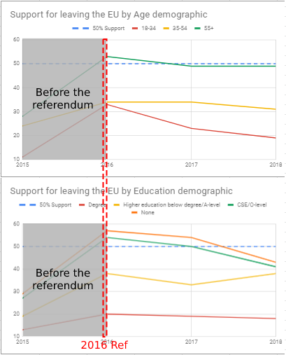
Showing the trend since 2016 would be far more sensible, so lets cut out the irrelevant data from before the referendum and just look at what's happened since, shall we?
Oh... that paints a different picture...
Support for leaving the EU has been consistently falling since 2016
Oh... that paints a different picture...
Support for leaving the EU has been consistently falling since 2016

In fact, not only has support for leaving been falling since 2016, it's below 50% in every single demographic.
To be absolutely clear: less than 50% of people think leaving the EU is a good idea.
To be absolutely clear: less than 50% of people think leaving the EU is a good idea.

"Lies, Damn Lies and Statistics"
Selectively choosing data is a way to misrepresent results. Compare the graphs on the left (from 2015) with those on the right (from 2016). They show the same data, but a sharp rise at the start make it look like there's overwhelming support.
Selectively choosing data is a way to misrepresent results. Compare the graphs on the left (from 2015) with those on the right (from 2016). They show the same data, but a sharp rise at the start make it look like there's overwhelming support.

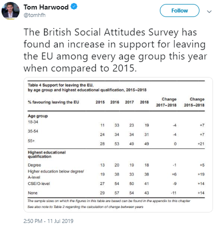
Another example of selectively choosing data to misrepresent results is presenting (hiding) the data in a table. As seen above, just throwing the data into a table made it immediately clear that what was being said didn't reflect the results.


And another way to misrepresent data (how did they fit so many into one table?), is picking and choosing what is being compared.
Why compare 2018 to 2015?
Why compare 2018 to 2017 and not 2016?
Simple answer: the results fit the fraud.
Why compare 2018 to 2015?
Why compare 2018 to 2017 and not 2016?
Simple answer: the results fit the fraud.

I've created a new table - same data, but more sensible comparisons. Suddenly it paints a different picture, doesn't it? Suddenly it looks more obvious that there has been a collapse in support of leaving the EU since the referendum.

Lastly, consider the bias of how the question is framed: "percentage of people who support leaving the EU". Psychologically, even a low-ish number like 30% or 40% seems significant - the reality is that in a binary choice and anything below 50% is a minority.
Reversing the question makes a significant difference: "percentage of people who don't support leaving the EU", or "percentage of people who support remaining in the EU".
Well, that looks better.
Well, that looks better.


If I were being pendantic or patronising (not uncommon) or trying to explain to the hard of thinking, then I could even annotate the graph, but that would be unnecessary, wouldn't it?