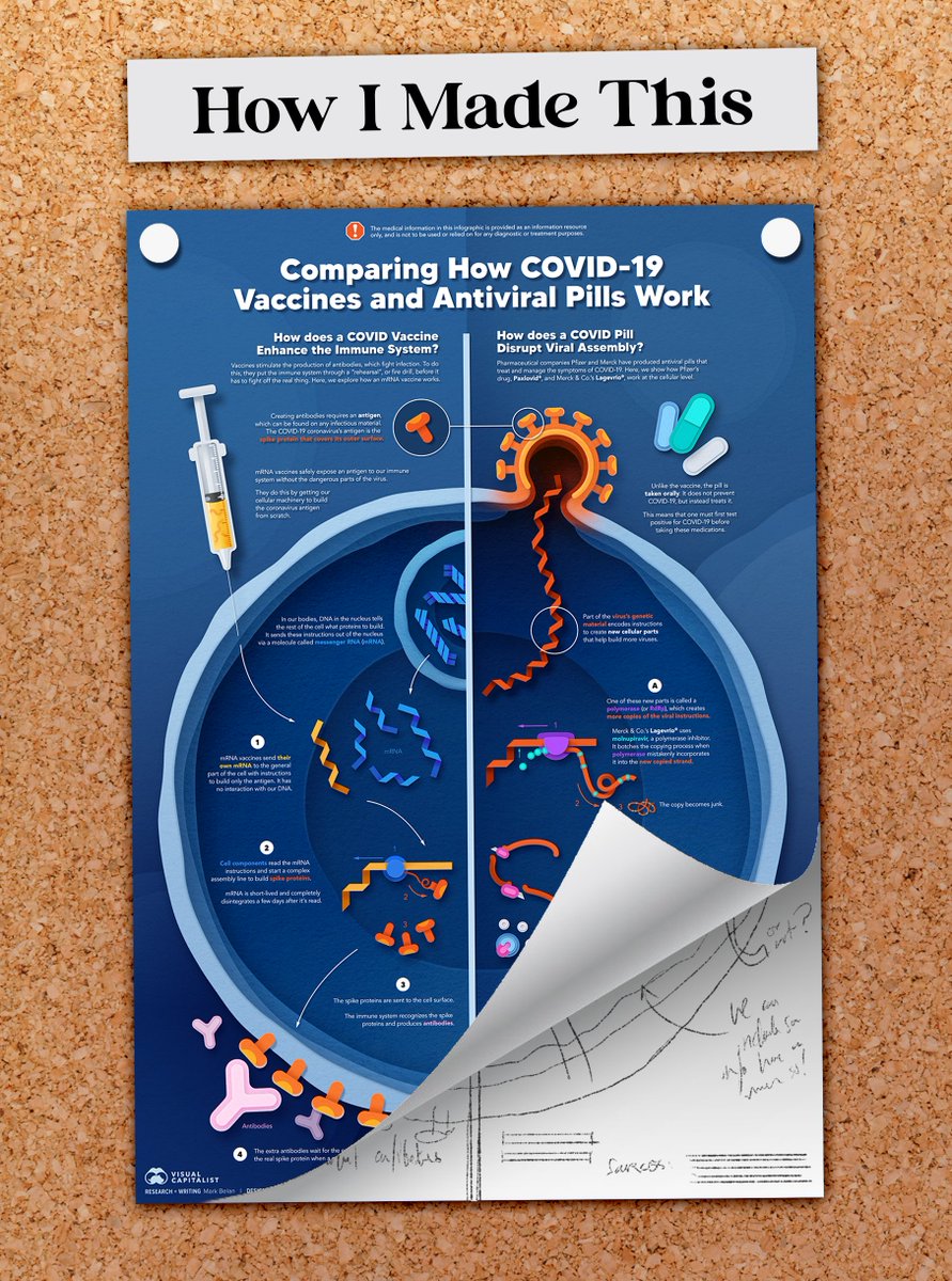
Dive-in for a peek at my #process and #designthinking on how I made my latest science infographic: "Comparing How COVID-19 Vaccines and Antiviral Pills Work" ⬇️🧵#COVID #Pfizer #Merck #DIY #infographic #vaccines #WIP #development #Covid_19 #paxlovid A poster showing "How I Made This", and a reproduc
The original inspiration for this piece was the newly marketed antiviral pills by Pfizer and Merck for the treatment of COVID-19. I thought with hearing so much about vaccines this year, and with pills entering the arena, people might be curious about what each does in the body.
When I started researching, I quickly learned that there were many types of vaccines. Here's one chart I found that explains this (left; by Nikita Ramesh, made with @BioRender). My first idea (right) was to convey ALL these types of vaccines against antivirals. A chart showing 7 major types of vaccines technologies and hEarly sketch of research and my arrangement for the infograp
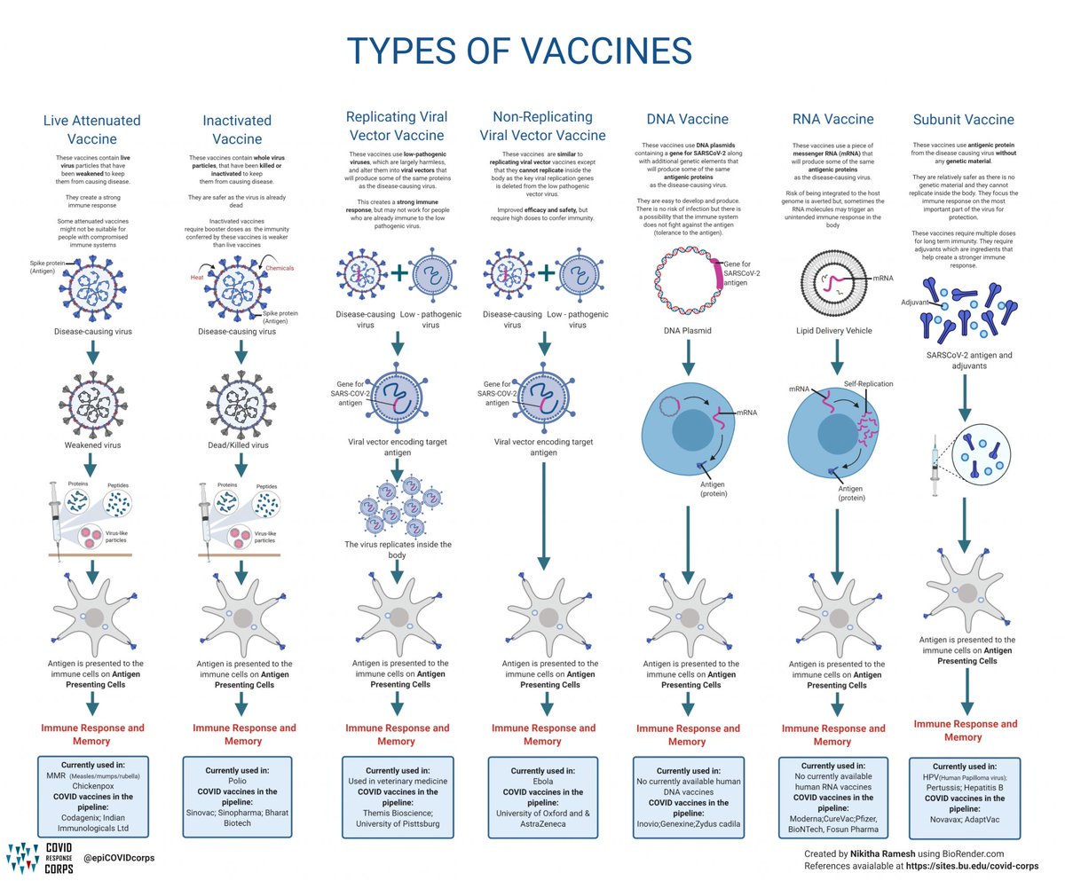
Fun Fact: I discovered that there is a yet-to-be-approved plant-based vaccine created by Canadian pharma company @medicagoinc. "Plant-based" here means that the "antigen" is a virus-like particle created by bacteria in plants medicago.com/en/our-technol…
My first idea became too demanding the more I worked on it. I was running out of "infographic real-estate", and I was being forced to cram information. I tried reshuffling so that I could introduce the necessity of an antigen, but the message was still TOO big. Early form of the infographic, showing some opening expositiAnother example of an early draft. Much like the first, it e
(Note: I could have just made it longer, but I knew this was going to be a bit of a "drier" piece and I didn't want to create a long, boring story, especially for a general audience. Also, I am personally not a fan of very long vertical pieces: scrollytelling gets boring, fast)
After some internal discussion with the VC team, we decided to streamline the message to compare major vaccines (currently: mRNA) and the two antiviral pills. This made the piece easier to read, w/ a cleaner comparison, and offered more room to expand on the science in each. Another version of the infographic. This one shows a cell asAn early sketch showing what I would have to compare between
Here, I was becoming more satisfied with the editorial potential: I could see a nice, big cell in my mind's eye as the hero graphic. Also, having two stories running parallel was a cool opportunity. Once this part was done, I moved on to figuring out how to "dress up" the piece.
I wanted to do something different (I always want to break the mould). I really didn't want to do "realistic" drawings of the cell; it felt too obvious and everyone else is doing it (to me, that's boring/cliche). So I thought: This topic is complicated. How can I show it simply?
This is where I began exploring the simple-vector idea, and drafted some early concepts by playing around with the Pen-tool in Photoshop (Fun Mark Fact: I really despise Illustrator, so I made all of this in Photoshop). An early draft of the infographic, with color. Here, it show
I was still unsatisfied with the look. It read "flat" and not engaging enough for my tastes. This is where I had the idea to amplify the simplicity by incorporating paper-craft visuals...an idea that I thought would make science "feel" simple and approachable. An image of the cell I created with a paper-craft look. It sA zoom-in on the coronavirus to capture it's paper texture.
I really liked how less "serious" and intimidating the paper-craft style looked: it felt fun and unique! I continued designing most of the assets to reflect this style choice, and I had a lot of fun doing it ☺️ Here are some close-ups I really like: 4 close-ups of the main infographic showing details of the p
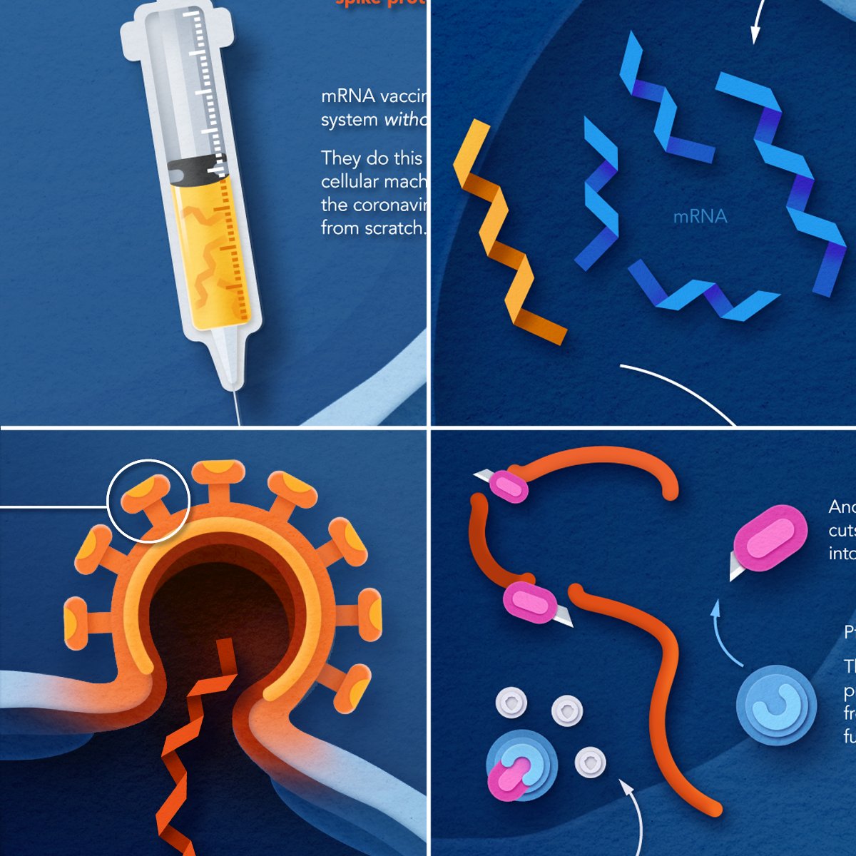
Wrt the science: it was relatively easy to explain the mRNA vaccine process step-by-step, but describing two different pills and how they worked in one space was tricky. I had to simplify it somehow. I went through several iterations of simplification: 4 complicated illustrations showing how I simplified the sci
^ That final iteration is so satisfying to me: turning proteases into mini x-acto knives (they cut!🔪), showing the cut-up polyprotein, and showing how to prevent it was to me a big improvement from the original illustration, which wasn't describing much.
Aside: I like my text treatment here. Instead of labelling everything, I chose color coordination to visually associate words with the illustrations. This is something I picked up from playing the Legend of Zelda games (they do something similar). A zoom-in of how Merck's Lagevrio (Molnupiravir) works to taAn image from the Legend of Zelda: Ocarina of Time. This imaAn image from the Legend of Zelda: Ocarina of Time. This ima
While simplifying the antiviral story, I also changed the infographic layout: I opened it up by removing some elements. Looking at the original felt cramped/claustrophobic and stressful. It just felt right to strip back the cagey-elements and let the piece breathe a bit. An image showing the before and after process of editing. Th
^ I also had to make a sacrifice on the opening exposition from the first piece (which was kinda redundant/not interesting, anyway!) ✂️ Less is more!
Just a few post-production edits, color touch-ups, and some magic-making in Photoshop to make things *pop* just a tiiiiny bit more, and you've got the final poster! 💉💊✨ Final Poster for "Comparing How Covid-19 Vaccines and A
This one was a lot of fun, and despite so many changes, it took about a week to produce. As always, I like to include a process gif, so here it is!
You can read the full piece at @VisualCap here: visualcapitalist.com/visualizing-ho…

• • •

Missing some Tweet in this thread? You can try to force a refresh
 

Keep Current with mark belan | science illustrator + info designer

mark belan | science illustrator + info designer Profile picture

Stay in touch and get notified when new unrolls are available from this author!

Read all threads

This Thread may be Removed Anytime!

PDF

Twitter may remove this content at anytime! Save it as PDF for later use!

Try unrolling a thread yourself!

how to unroll video
  1. Follow @ThreadReaderApp to mention us!

  2. From a Twitter thread mention us with a keyword "unroll"
@threadreaderapp unroll

Practice here first or read more on our help page!

More from @markabelan

Aug 23, 2022
Alright, gonna try sharing some of my visual strategies + tips for visually communicating science on a more regular basis.

🧵 Let's start off with figure labelling. And let's use this image from a paper I just read as an example:

#science #biology #scicomm #vizscicomm #datacomm Image
First - I love the stippling illustrations. This is a nice technique that offers good contrast between structures.

The labelling, however, is a serious impediment to the eye. Subconsciously, our brains are trying to break this down + are taxed with making sense of this info🧠⚡️ Image
When we visually communicate technical images, we need to be mindful of how the eye travels, what information it's picking apart, and how we can alleviate any strain or taxation that may interfere with - and disrupt - our ability to absorb new information. Image
Read 17 tweets
Apr 25, 2022
After a successful weekend with Biomass again, I figured I'd share a bit about its inception 🧵⬇️

HOW I MADE THIS: Visualizing the Biomass of Life #biomass #wip #process #art #science #datavisualization #dataviz #infographic #biodiversity Visualizing the Biomass of Life infographic pinned onto a co
The original paper that this graphic is based on was published by @yinonbaron @MiloLabWIS @WeizmannScience. It came across my desk working at Visual Capitalist and the crew wanted to see what I could do with it. pnas.org/doi/10.1073/pn…
There was already a graphic explaining the key findings in the paper, shown here. It's a really nice Treemap visualization using a #voronoi pattern (random Fun Fact: voronois are everywhere in biology: bone matrices, cell shapes, wing scales, etc.) A treemap in voronoi style showing the distribution of bioma
Read 23 tweets
Mar 28, 2022
Good morning followers, new and not-new! After the flux of newcomers this weekend, I thought I’d introduce a little bit more about me + my journey so far to becoming a scientific/data illustrator. Read within! ⬇️🧵🪞🔬👨🏻‍🎓 #bio #aboutme #art #artist #scientificillustration #sciart Portrait of MarkIllustrated banner for Mark...Illustrated banner for Mark...
My name's Mark and I am super passionate about telling science stories with the power of visual media🎨 I love illustration, I learn best with visuals, and I am constantly looking for (er, doodling?) ways to make pictures say MORE than just "a thousand words” 😉 Introductory portrait of Ma...Showcase of various example...5 icons in the center of th...Picture of Mark drawing on ...
I've always been drawn to art as a kid. Ever since I could hold a pencil, I've been creatively engaged. Growing up I was discouraged from pursuing art (who wasn't?) and so I gradually developed an interest in science. Natural History is my favourite subject. 🌐🪱🐒🦀🦩🍄🪸🪐✨
Read 16 tweets
Nov 30, 2021
And here we go...
PART TWO: Visualizing the Accumulation of Human-Made Mass ⚖️🏗️🛠️🧱🔩 (incl. 🧵) #anthropogenicmass #biomass #construction #mining #dataviz #infographics #sciart #datavisualization #visualjournalism #science #scicomm #scienceillustration #anthropocene Infographic/data visualization comparing the total dry weigh
Since 1900, we've been making a LOT of stuff...and it's been piling up. In 2020, the material output of humans on Earth SURPASSED the total (dry) weight of all living things on Earth!
One grim part to this story (there's many 😵‍💫) is that we've now produced double the weight of plastic than the entire Animal Kingdom. Two groups of blocks, representing data, showcasing that the
Read 7 tweets
Oct 11, 2021
NEW PIECE: A Visual Introduction to the Dwarf Planets of our Solar System🔭🌕🌑🪐 #dwarfplanets #space #dwarf #outerspace #planet #pluto #infographic #dataviz #orbit #scicomm #sciviz #nasa #spaceart #visual
This one is a fun topic for me - I've always been fascinated with society's disdain for Pluto's downgrade, but the complete lack of interest for the other members of Pluto's family!!
You'll notice there's more than 5 of the IAU's recognized dwarf planets. This is because I referenced additional planets that are agreed upon by @plutokiller, @GonzaloTancredi, and Will Grundy @LowellObs. Depending who you ask, there's more!
Read 5 tweets

Did Thread Reader help you today?

Support us! We are indie developers!


This site is made by just two indie developers on a laptop doing marketing, support and development! Read more about the story.

Become a Premium Member ($3/month or $30/year) and get exclusive features!

Become Premium

Don't want to be a Premium member but still want to support us?

Make a small donation by buying us coffee ($5) or help with server cost ($10)

Donate via Paypal

Or Donate anonymously using crypto!

Ethereum

0xfe58350B80634f60Fa6Dc149a72b4DFbc17D341E copy

Bitcoin

3ATGMxNzCUFzxpMCHL5sWSt4DVtS8UqXpi copy

Thank you for your support!

Follow Us!

:(