,
12 tweets,
5 min read
Read on Twitter
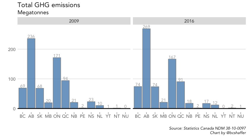
First up. Total GHG emissions by province, 2009 and 2016 (date range of this data). Note: these totals will differ slightly from the National Inventory Account data. Explanation on that here: www150.statcan.gc.ca/n1/daily-quoti… 
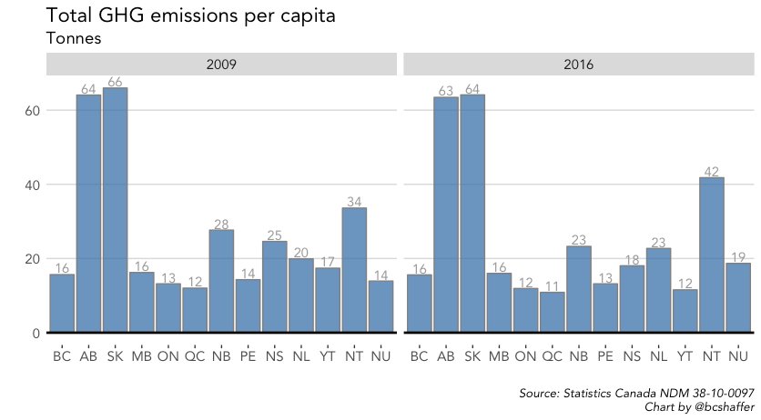
Now let's "per capita" that data. SK jumps up. AB actually declines (*slightly*) between 2009 and 2016 due to population growth.
We can break it down a bit further, looking at INDUSTRIAL and HOUSEHOLD emissions. First let's look at industrial emissions. Still the big driver behind AB and SK GHGs:

*Household* emissions look quite different. Large differences across provinces here due to emission intensity of their electric grids, fuel sources for heating, and transportation:

Lastly, because it wouldn't be a true chart thread without at least *one* animated plot, here's the battle for household emission supremacy across the provinces since 2009. Must be something in the potatoes...
</fin>
</fin>
Ok. Not "fin".
2 more, because they're interesting (to me). Looking closer at household emissions. We can break it down into "electricity and other fuels" and "motor fuels" (think: driving).
Here's electricity. Across the board drop in per capita emissions due to a cleaner grid
2 more, because they're interesting (to me). Looking closer at household emissions. We can break it down into "electricity and other fuels" and "motor fuels" (think: driving).
Here's electricity. Across the board drop in per capita emissions due to a cleaner grid

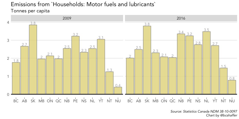
And here are motor fuels (and lubricants). Not the same fall. Flat to up in most provinces between 2009 and 2016. SK stands out.
A few more plots, digging further into sector-level data. Here's the time trend for emissions by sector (top 15 emitting sectors).
Electricity emissions declined while those from O&G climbed from 2009 to 2016.
Legend is ordered according to 2016 ranking.
Electricity emissions declined while those from O&G climbed from 2009 to 2016.
Legend is ordered according to 2016 ranking.

Another way to view the data: a scatter plot of 2009 and 2016 emissions. Above the 45 degree line is an INCREASE in emissions. Below the line is a DECREASE. Point size scaled by 2016 emission size.

Emissions change by sector, 2009 to 2016.

Same as above, but % change in emissions by sector.