,
122 tweets,
35 min read
Read on Twitter
gravis master thread on PC golf videogame aesthetics
PGA Tour 96 (DOS)
the water has ripples, and the ripples affect the reflection. It looks real real good.
the water has ripples, and the ripples affect the reflection. It looks real real good.

the course is matted into the game world. your ball moves over it in realtime (typical for the era, but crucial nonetheless) and when you start a new stroke this comical red arrow shows you where it is, which wasn't all that common


when you strike you get two windows, a realtime top-down view tracking the ball, and a reverse shot from the hole. it's a good choice, but also, the silver frames

channel topic has been changed to "90s PC Software Targeted At Adult Men With Dithered Depictions Of Executive Office Furniture"
i mean,

interesting: the menus are all carefully mocked up skeumorphism, but the scorecard looks like it's lifted from a VB app. bad form!


it took me a while to figure out that this is the menu button that starts the game

d i t h e r

pga96's trees look almost digitized, but i suspect they were partially pixeled and then convoluted. they aren't the worst but they don't quite match the environment. up close though, they have a strong @DataErase mouthfeel


FMV in golf games was a mistake from the word go but this one particularly screws the pooch. I'm fairly certain the res was so low it ate the club (if the actor even had a club) and they had to redraw it after the fact

This, This, And This Are All Not It, Chief

more on the trees: what is going on here at the base? this obviously isn't desirable; why was it left in? they have absolute editorial control, they're just pixels. why leave this in?


it's interesting to see the texture stretch horizontally as its rendered closer to the camera. i think i understand why, sorta? i highlighted a specific color to show it off better


idk why the video captured at this aspect ratio but please check out this great shot
look i had spotify radio doing pop punk that's just what was on
WHIPLASH
the two genders

OOF

bleak

those pics were from "CADDIEHACK" by the way
NOW THAT, IS A FUCKING TITLE SCREEN

(this turned out not to be a golf game, it just matched a fulltext search)
now that's a good look and a good feeling

oh now that's just uncalled for

oh it gets *worse*

now see what's weird is here it starts getting better

like these diagrams are sick

and the actual swing has like 30 frames of animation. in CGA, that's impressive


by the way, this image doesn't not belong in this thread

'course, though, this one's late enough (93) and made by a capable enough company that it doesn't really look weird. very solid.

the konami one is... eminently serviceable. nothin doin
core design made a jolf game

this one (The Scottish Open Carnoustie Virtual Golf) is a high framerate full 3d port from the playstation from 1995 so it's an entirely different experience than any of this other stuff while stil having a DOS flavor, but iiiiiiit's also very overcast


i don't fully know what the answer to this next question is: why did so many VGA games either have a hot, bright palette *or* a deeply, tremendously somber one? i can google "VGA palette" and sure, those are the options i see here, but I thought you could redefine it?

sommmmmmmber


er, rather, the first two are somber for some reason, the latter are lesss so. and i mean look at jazz jackrabbit or


or god of thunder (was the second pic) god i suck
this one's also pretty boring i believe but i love any golf game with a spinning golfball on the title

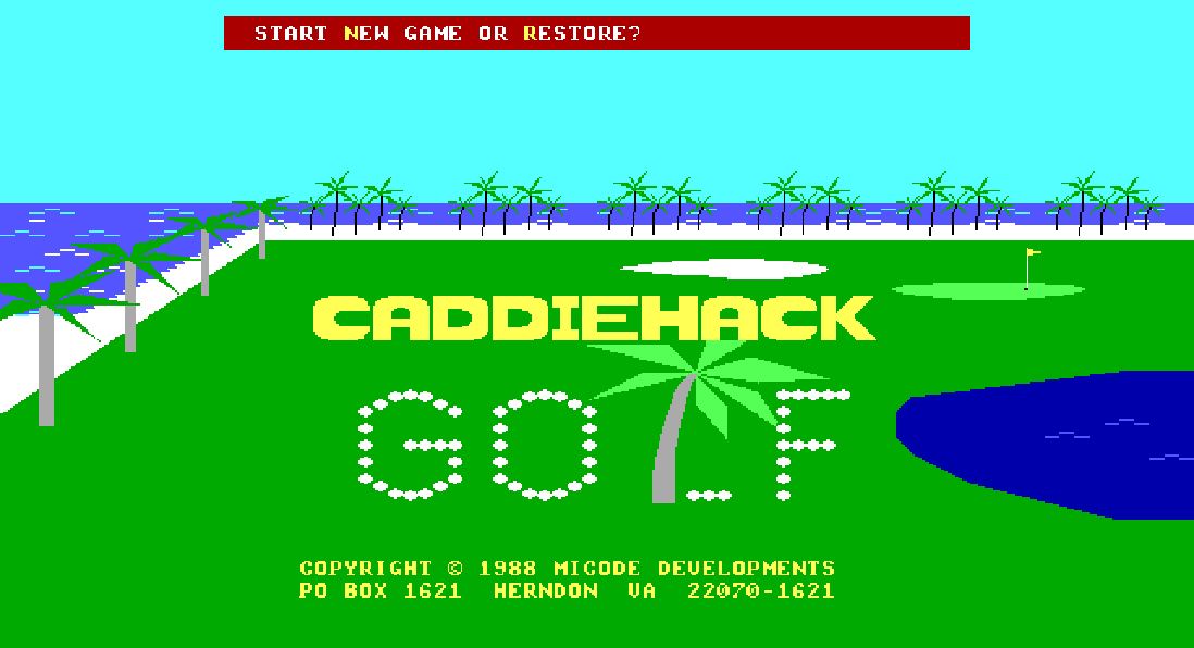
starting up my new youtube series where i review, in depth, *only the scorecards* in sports games. subscribe and make sure you hit that bell

this one does deliver, at least, a solid isometric view of the chourse

nice smooth rendering, good pixeled trees, but still a little DOS-crunchy.

really love the flyover on the ball tracking! swing mouthfeel is kinda iffy but the actual flight is great
for comparison, look at how unsatisfying the ball tracking on this one is. the camera strictly follows the ball, it's just... bleh. bleh!
the awkwardly named "Ryder Cup - Johnnie Walker" is another game with a very strange mouthfeel. golf has a VERY consistent mood IRL and to have games that apply strange, sort of dark tones around it is *very* odd
let's just get this out of the way: the menu music slaps, bops and is a banger
but it IS tonally inappropriate for golf, and then you get ingame and... mm. I don't like it. I don't, honestly.

see
I remember the old george carlin Baseball And Football bit, in which he says
Baseball... pastoral. 19th century
Football... technological. 20th century
To me, golf is technological. 20th century.
I remember the old george carlin Baseball And Football bit, in which he says
Baseball... pastoral. 19th century
Football... technological. 20th century
To me, golf is technological. 20th century.
most golf games IMO come off as one of two moods:
1) modern, 20th-21st century commercial sports
2) suburban dad out playing a few links of the kings game
1) modern, 20th-21st century commercial sports
2) suburban dad out playing a few links of the kings game
all the wood and the american flag and shit set this game up to feel like a... log cabin kind of aesthetic, like a Down South, 19th century, fuckin, good ol boy feeling that i distinctly do NOT like
I... really hate the ingame UI. Once you're in proper, your face will just screw itself up like "what the fuck is even this." I have so much to complain about.

the swing controls are built into a mockup of a golf club that takes up an awkward chunk of the viewport?? like, really guys? fucking really? that's bush league UI dark pattern shit, get that shit out of here
mystery meat nav; i have no idea what most of this means. why's the swing control so fucking small compared to the immense club that dominates the whole-ass lower right corner? couldn't spare another inch of that 1 wood for something I can actually fucking use?
grass looks like shit. clashing mix of detailed textures and generated gradients; don't do it, poor choice, bush league. What is this it looks like someone fuckin clone brushed it. is this a shitpost

trees look like ass. is it overcast or not? I can't tell but something about this whole thing makes it feel lonely and somber and other VGA golf games don't have that problem; get with the program
hate this sprite design to be frank. mushy, clashing styles. the trophy has colors that only could have come from being bitcrushed in an image editor, while other sprites are clearly hand pixeled. BAD FORM. bush league. get that shit out of here

i hate this american flag. ignoring the unusual decision to go with the lesser known *eleven star* design, it's not bright and cheerful. like everything else here, it's dim and just feels like it's hanging in a forgotten place. fuck this flag. buddy, they won't even let me fuck i

that's exactly 280 characters. i noscoped that one. you don't do that by accident. i come here to win.
i do not like this mouse cursor. it reminds me of the bloody severed hand from NESticle and is, once again, tonally inappropriate for golf. it... something about it... it just... i don't like it. it's not bush league, but i still need them to get that shit out of here

all text that appears over the play window uses this VERY deep shadow offset and these *embedded graphics* so they look like diecut pillow stickers? the tree clashes with the trees behind it. it's hard to read, bush league, get that shit out of here

the real treat comes when you actually do a swing though, the ball moves like it's being picked up by a UFO and the camera moves like Alone in the Dark. i hate it, and it makes me really uncomfortable.
it just... does not feel like golf to me, and I think lots of golf games Feel Like Golf. this one's a swing (heh) and a miss (heh)
time for b'bed
"bad form" was an unintentional pun
uncalled for
oh now *that* is uncalled for

well thanks, also fuck you

alright!! now that's a good looking CGA golf course! i mean it ain't perfect but it's a damn sight cleaner than the others we've seen

(this is PC Pro-GOLF (1989) - CMA Software)
unfortunately uh
it kinda falls apart. there's the traces of two shots, XORed over the course. it's uh... not good enough.
it kinda falls apart. there's the traces of two shots, XORed over the course. it's uh... not good enough.


i swung three times and

okay, it's not an XOR, it's just two specific colors, and it works pretty well if you aren't smacking the ball out of bounds

when you make it to the green, it switches to this radaresque view and then lets you putt in *raw decimal-entry feet*. ultimately this plays more like some kind of weird simulator than an actual game


my new twitter avatar
fuck you also

at the beginning it asks if you're on a tandy but if you say yes it just changes palettes?

EA's World Tour Golf has a bleak but remarkably Designed menu

look how fuckin many courses are included

this is one of the best looking CGA golf titles. very distinct.
hot take: this is the only good CGA palette.
hot take: this is the only good CGA palette.

ball animation is understandably awkward, but overall it's plenty dynamic
i can't actually figure out how to play enough to get past the first hole
absolutely scrumptious. delicious

alright. so. comments. Links: The Challenge Of Golf is another title with excellent, but tonally inappropriate menus. look at this. these menus are cool as *fuck* but - this is a damn golf game! golf!! this isn't what golf looks like!


additionally, let's dig into this for a hot, smelly second: the fuck are these? game came out in '90. the fuck did anyone have headphones what looked this way in '90 that weren't $20k audiophile rigs? and even then?
Further More
Further More

in my estimation, this kind of design didn't exist until the VGA era had more than closed, unless you were rocking some MAJOR high end SHIT - ignoring that, putting it to one side, how did these make their way to the artist, and why did the artist think they would resonate?
these are some mondo cans. so like, was the pixel artist getting paid *way* more than their position typically did? did they just drool over these in Stereophile? why aren't they some shit Creative pack-ins?
other than that, the sound control panel is an absolutely striking example of 90s VGA-era design that just doesn't belong in this game. let's move on.
ok but seriously look at this though! it looks like Pixel Painters made it.

Laser Light, for comparison. Scorched Earth for comparison. somber 'games


okay. well. so. i have complaints. what is this style? these are digitized.... renders? photos? i don't like this whole scene! it's so dark at the edges! why! golf is a bright, sunlit game! why would you make it so damn MOODY

on the left: golf, according to google images
on the right: Under A Killing Moon, typically moody-looking DOS adventure game
why does this look like the *second* one
on the right: Under A Killing Moon, typically moody-looking DOS adventure game
why does this look like the *second* one


okay so in the game itself, i have further complaints. this is an odd one IMO

there's a lot of clash going on here. first, obviously, the uh, hoops. they were bashed together by a programmer late-stage. coulda done *any better* though, that would have been kind
i hate the terrain rendering, frankly. it looks like all the sins of bilinear filtering laid bare, except a type of scale filter I don't know and definitely don't have a neuron dedicated to hating
the character is FMV and not good FMV. the left edge of his back is a sad green. that's a pass from me, but at least he doesn't have Fringes
this is a weird nitpick, perhaps: i feel it's dirty pool to make a treeline like that, then leave it blank at the edge of the screen, because your brain is gonna say "wait, no trees... and no buildings... no road... nothing? we golfing in fucking Kansas"

the status bar has all this negative space. Now Friends
you read that in the Alice's Restaurant voice and if you don't know what that is go listen to Alice's Restaurant, come back when you're educated. Now Friends
i am a proponent of clean UI designs that go easy on the palette dips and do what's necessary over what's print-ready but i- just can't get on board with this negative space! Like Whoa Buddy, why's there so much Damn negative space! that sea of grey is KILLING my enthusiasm
also - take - DOS take here - thing that always bugged me - text fields in a game that will, eventually, have something in them, *but don't right now*, and are unlabeled.

let's just outline this one real quick: Quarantine (1994), the car in the demo was carpeted in dead displays for weapons and items you couldn't unlock, and in particular, this little LED readout was BLARING 00 at me the entire time. i never had the commercial version. not cool


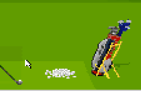
anyway. do want to say: i really like that they included the golf bag, and since it's the driving range mode, a pile of balls.
actual swing experience and rendering is perfectly sound, unsurprising for the early VGA era. no complaints, nothing special
i don't like this. i feel uncomfortable. the two of them are watching me

at least during the actual swing phase the UI becomes more populated

okay this is definitely a better scorecard than a lot of these but that blue is just uncalled for

here, enjoy one hole of the king's game
hmm

there's a number of titles that were pretty clearly converted from some higher bit depth through raw, barbarian bitcrushing, And Folks It Don't Work
i guess there's not many other fish in the sea at this tech level and you might as well do whatever you can
i guess there's not many other fish in the sea at this tech level and you might as well do whatever you can

i'm not really sure where the source art came from. the EGA version doesn't look remotely similar

I find the EGA version of the game highly unexciting, but at least we get this tree rendering sequence
yeah, and if i rerun the EGA version but select CGA, it's a different opening screen. so i suspect the CGA-only version is very different let's see

here's the "EGA version" with CGA selected, and then the CGA-only version. seems like the same game but they differentiated the trees in the second release. good choice


turns out RISC - the people who made that weirdass, overly-dark Scottish golf championship game? - made other golf games, one's called Hole In One, and it's very similar but *also weirdly dim*

I, Just, Like. why is the sky not bright blue? why's the cloud that dingy peach color and not greyscale / blueish? but hell. at least the UI isn't so obnoxious
jesus christ, yet ANOTHER bizarrely dark golf title!


1/2: this golf game
3: Abuse (1995)
4: Pyrotechnica (1995)
3: Abuse (1995)
4: Pyrotechnica (1995)


look at the main menu. look at how somber it feels. then look at the same screen with the brightness and saturation turned up a little. looks like golf!


the shading on the course seems so severe. real golf courses always seem Fullbright to me.