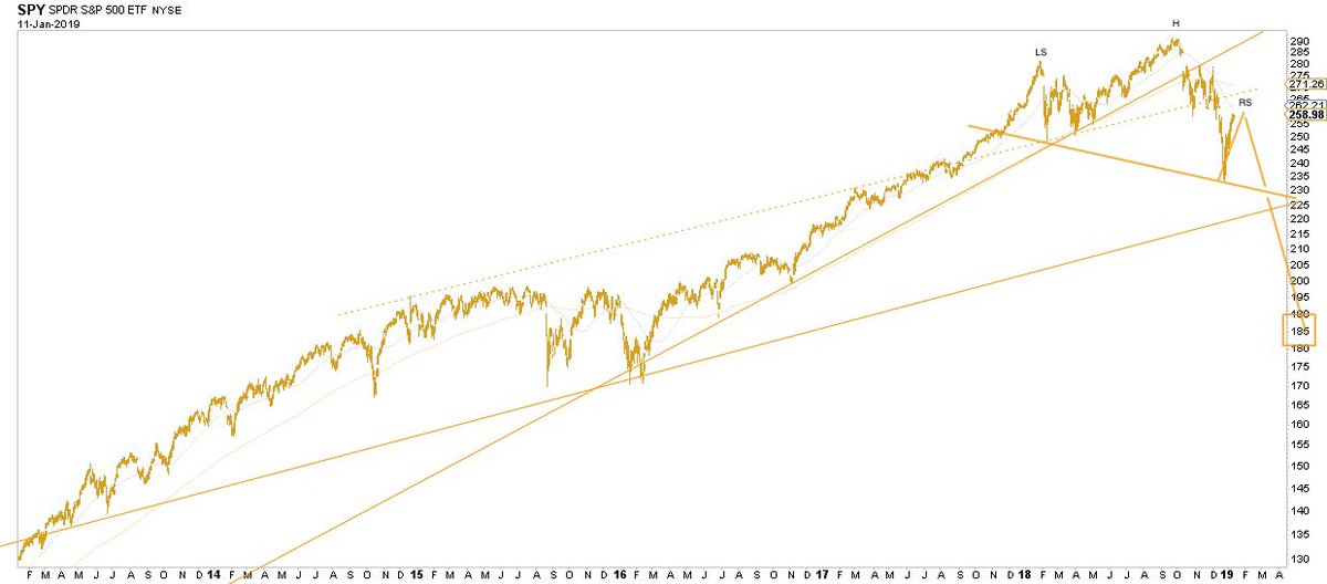
I got 15 interesting charts to share with you guys covering everything from price, breadth, sentiment, credit spreads, volatility, economic data and more.
I'm merely commenting on what is. There are no opinions, suggestions or narratives here — just objectivity & focus on the one true measure: the price itself.
Take notice of that, it's important. Ask yourself if you are getting anything close to that over the 3, 5, 7 or 10 years?
If yes, why? If no, why not?
Volatility can rise together with equity prices. Remember the late 90s? This process went on for quarters, if not years.
But then you look at their performance over 3, 5, 7 or 10 years and they are failing to keep up with $SPY ETF.
However, what you want from this indicator is high readings of 0.44 & over, right after a bear market or a sharp correction.
Valuations we covered last Sunday. Long term, US equities are priced to disappoint. They did achieve a stellar 10-year CAGR of close to 17%!
Every man & his dog are covering the yield curve right now.
I wonder if my recency bias is the cycle similarities between 1998-2000 & 2018-20xx?


