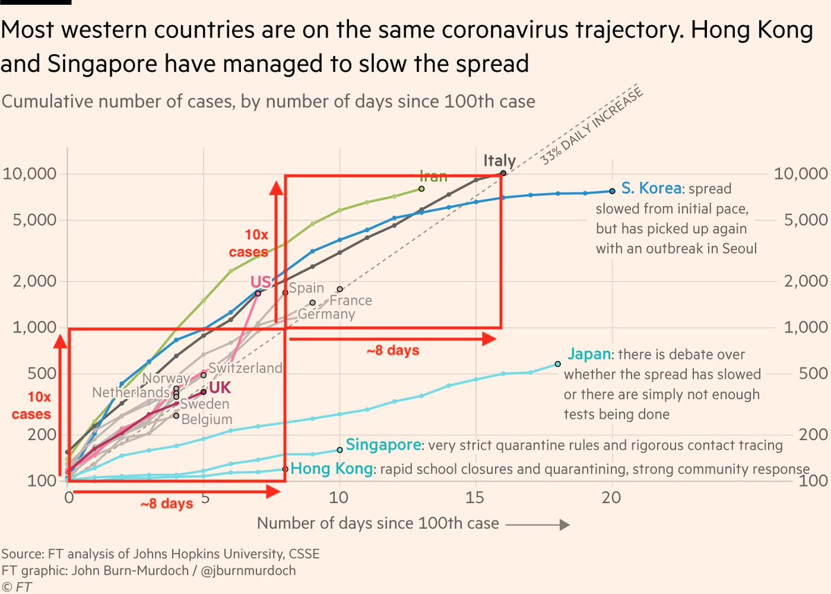
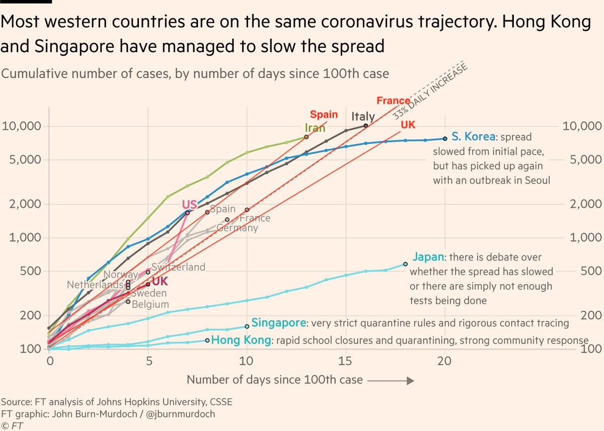
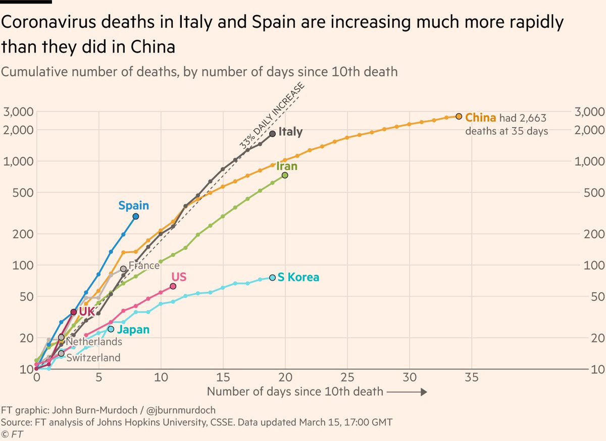
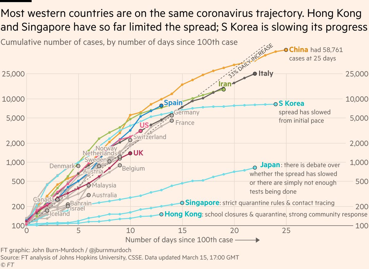
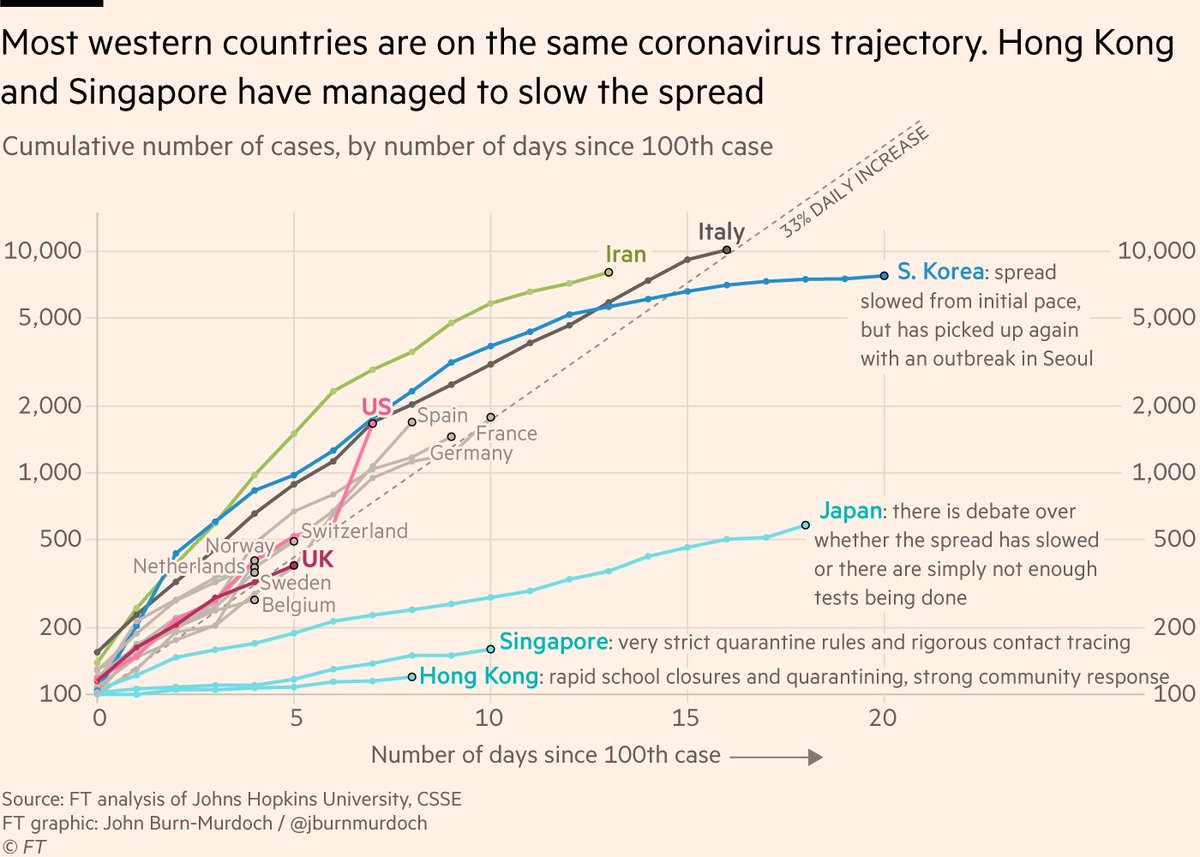
1) In the initial outbreak phase, a virus like this spreads exponentially not arithmetically, i.e a log scale is the natural way to track the spread
When a reader ponders this chart, they’re asking "are these two countries on the same course", or "how many days til country X is at Y cases", not "how many pixels represent 100 cases" etc.
The log scale version of this chart does that, where the linear scale version would be a) less useful and b) more panic-inducing
Fin.


