In this thread I'll be looking at some data & charts of COVID-19 spread in MENA states. All of them, not only the ones shown in this chart. I'm in self-quarantine myself so let's see how much energy I have. 
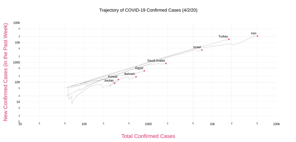
First a note about the choice of graph. The one above makes the wise choice of *not plotting against time*. Instead it plots total cases vs weekly new cases. It also plots *on a logarithmic scale*, so the diagonal = exponential growth.
These two changes make a huge difference. They allow us to visualize not the *absolute number* of cases but the exponentiality of growth. "Flattening the curve" is preceded by a lower number of new cases (relative to existing ones).
Also, plotting on a log scale allows us to look at countries with vastly different absolute numbers side by side. In the graph above, Turkey and Iran look close by, but Iran has 50,000 confirmed cases and Turkey 20,000.
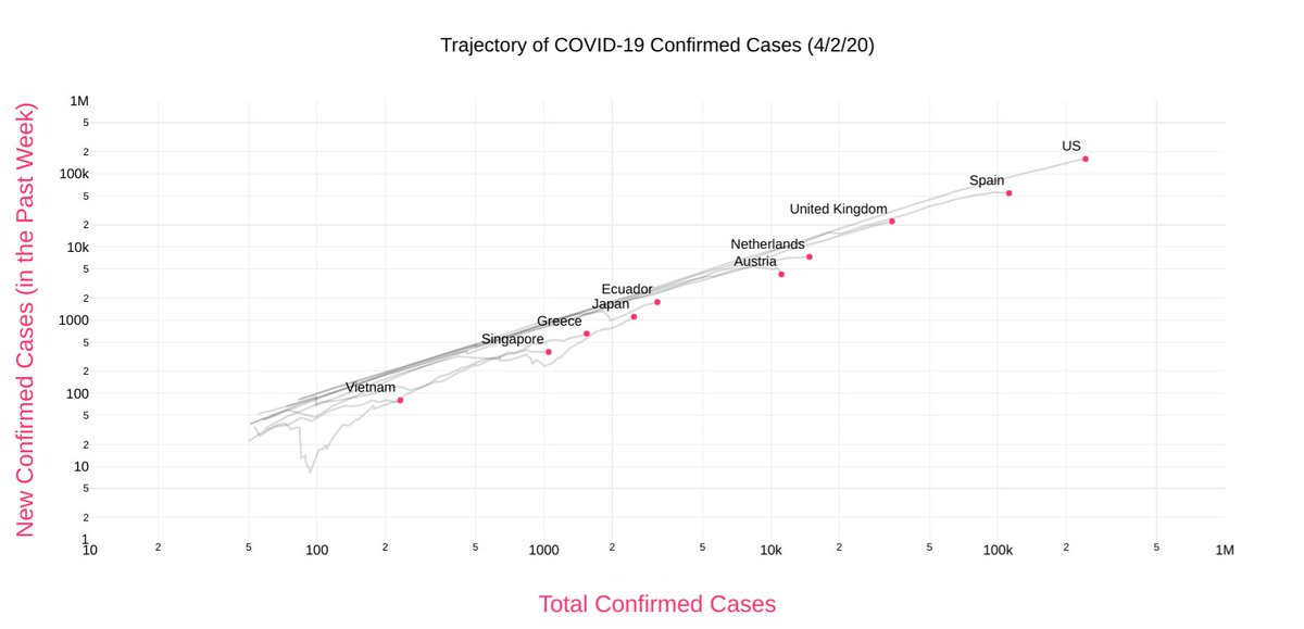
If we look at the data across the world, there is clear exponential growth seen in all countries regardless how fast they brought the pandemic under control. Here's a sampling. Remember diagonal = exponential.
This particular chart is actually animated (so you can visualize time), you can see all the data and check the graphs of individual countries here
aatishb.com/covidtrends/
aatishb.com/covidtrends/
Now on this particular graph, when a country starts to "flatten the curve", the weekly new cases start to slow down, and the graph bends sharply downwards, such as these countries here:
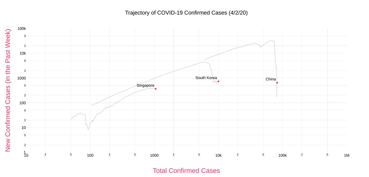
You see there, for example, that:
- China's curve started to accelerate again in the last two weeks
- South Korea turned sharply down, but the descent has stalled
- Singapore had it under control but it later got out of control again; they're now starting to get a hold on it
- China's curve started to accelerate again in the last two weeks
- South Korea turned sharply down, but the descent has stalled
- Singapore had it under control but it later got out of control again; they're now starting to get a hold on it
Here's the charts of a bunch of countries that went under lockdown during the same week (between March 8 and March 14th). Different numbers, similar trajectories.

Now note how the curves for Qatar and Kuwait look markedly different from the others. It just seems to... crooked, like the trajectory changes sharply from week to week. I've noticed the same in many countries, many of them being autocracies.
The graph plots weekly new cases vs total cases, so if a country doesn't report new cases until a week later, the trajectory seems to fluctuating. I don't know if this shows an attempt at manipulation, or simply that some countries don't update their tally frequently enough.
I'm gonna take a break (this fatigue really sucks).