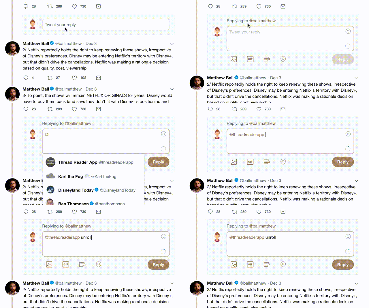
Light text on dark backgrounds highlighted the early web as coder types latched onto that aesthetic.
But we quickly learned that a high contrast environment puts major strain on the eyes.
(As a rule, you want the object of interest to be effortless to focus on. B on W achieves this, W on B achieves the opposite.)
You end up repeating old mistakes just to "stir things up" or to create a new trend that makes you feel like you started something significant.
But all you did was screw everybody else over.
The point should simply be to de-emphasize everything else BEHIND the object of interest.
They can be dark, as this emphasizes the favicons while de-emphasizing the tabs themselves.
Overall effect is greater clarity—better ability to focus on the item of interest OR on tab decisions.
Now, every a$$hole who knows CSS is simply setting up high contrast environments and declaring themselves compliant with the latest "sh*tty future" trend to come out of Cupertino 🤷🏾♀️


