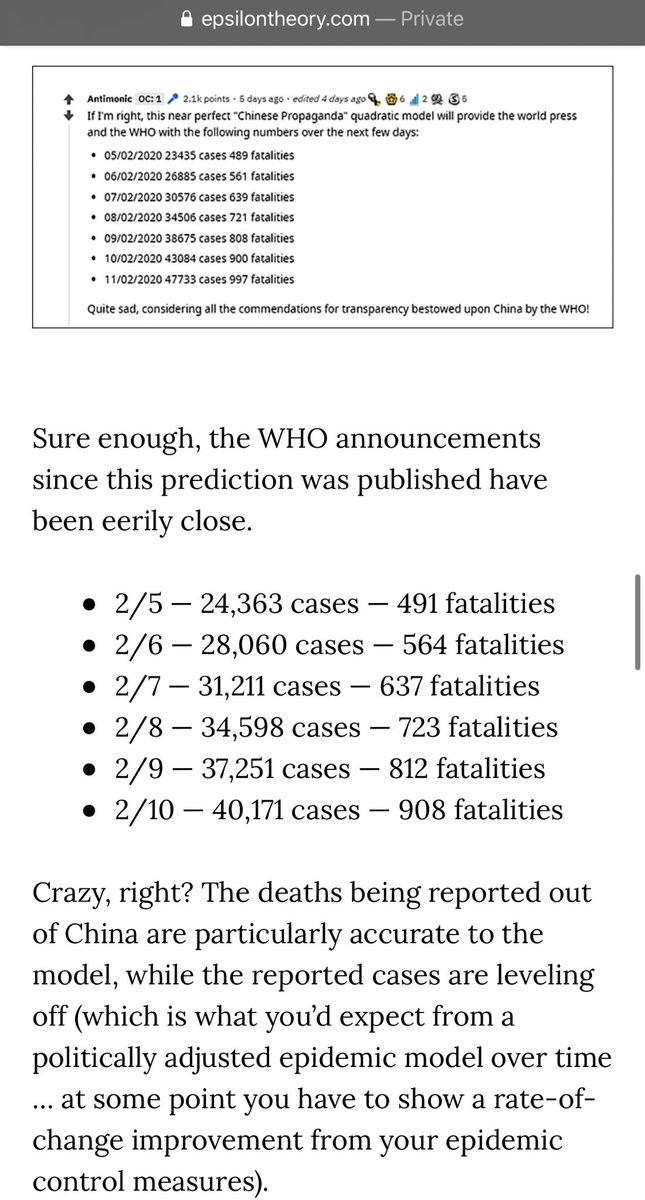
Best evidence: a curve fit several days ago did indeed closely predict reported deaths.
Rest-of-world numbers at JHU are likely more reliable.
epsilontheory.com/body-count/
Qualitative reports from on the ground as well as the scale of quarantine suggest significant underreporting.
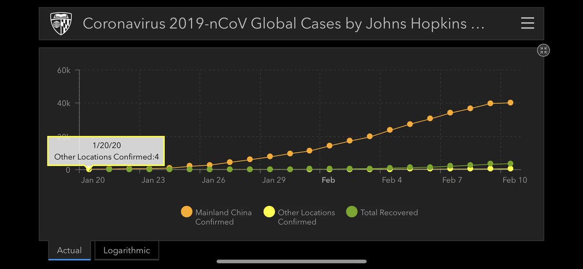
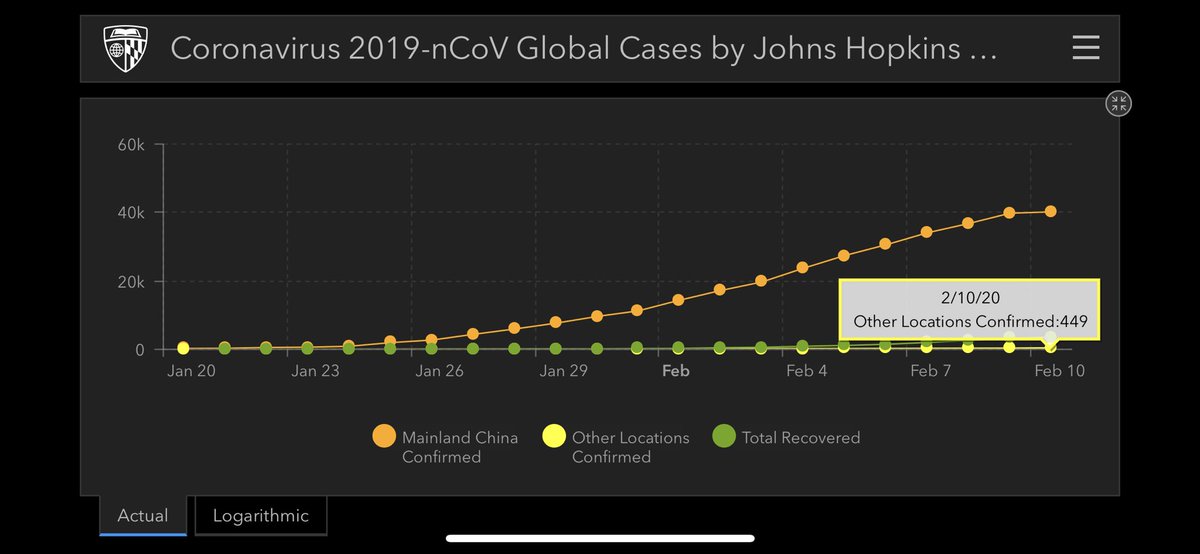
What about rest of world numbers? Well, they have increased >110X in 20 days, from 4 to 449.
gisanddata.maps.arcgis.com/apps/opsdashbo…
Can’t seem to see his FB post though. @robertwiblin, could you post your analysis?
2) And here is the raw link to the WHO data: who.int/emergencies/di…
Check predictions against reported deaths for yourself.
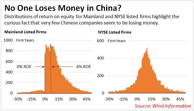
There may be an innocent explanation here due to incentives for cutoffs, but would love to see an independent replication of this chart.
seekingalpha.com/article/403153…
Or if death rate varied across time due to new hospital beds, may see declines.
Still feels too clean, IMO. But we are reasoning from small data.


