NEW: Tues 31 March = overhaul of coronavirus trajectories
As the story shifts, the charts shift. We’re now focusing on *new* cases & deaths rather than running totals.
Why? Because key for any country is when today’s new cases are fewer than yesterday’s
ft.com/coronavirus-la…
As the story shifts, the charts shift. We’re now focusing on *new* cases & deaths rather than running totals.
Why? Because key for any country is when today’s new cases are fewer than yesterday’s
ft.com/coronavirus-la…
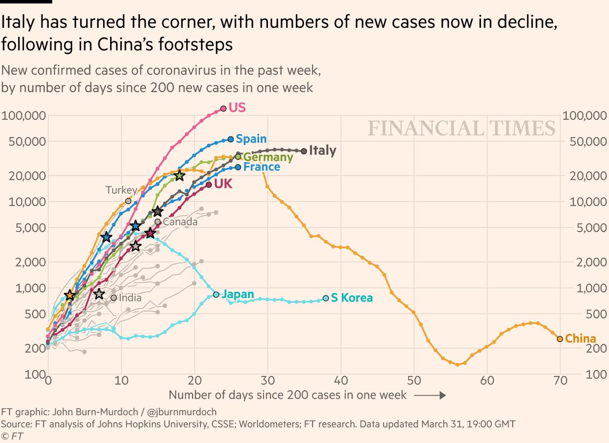
How to read the new charts? x axis is still days into outbreak, but y axis is now the number of new cases in the past week.
Line rising? Each week brings more new infections, outbreak is accelerating.
Line falling? This week was better than the last. We’re past the worst of it.
Line rising? Each week brings more new infections, outbreak is accelerating.
Line falling? This week was better than the last. We’re past the worst of it.

Loads of stories in here
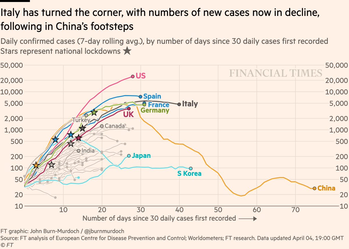
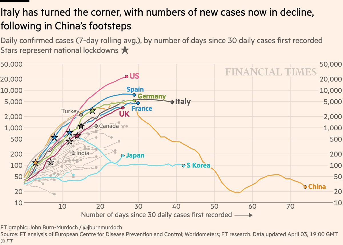
• Italy has turned the corner. New cases falling
• US? >100k *new cases this week*
• China squashed its outbreak, but as restrictions are lifted, cases rebound. Lockdowns don’t end overnight ⚠️
• Japan looked like a success story, but cases now rising
• Italy has turned the corner. New cases falling
• US? >100k *new cases this week*
• China squashed its outbreak, but as restrictions are lifted, cases rebound. Lockdowns don’t end overnight ⚠️
• Japan looked like a success story, but cases now rising

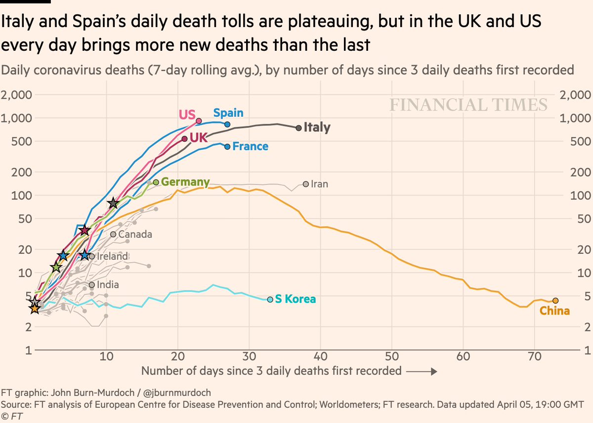
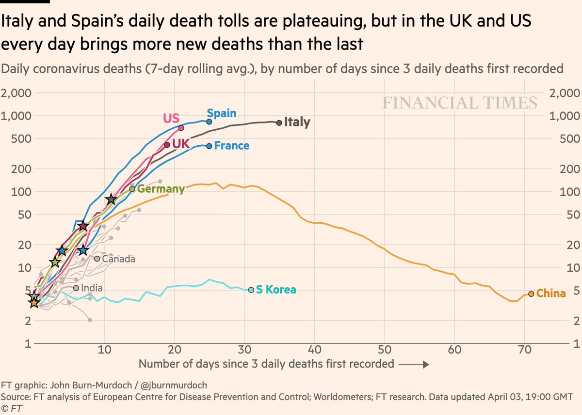
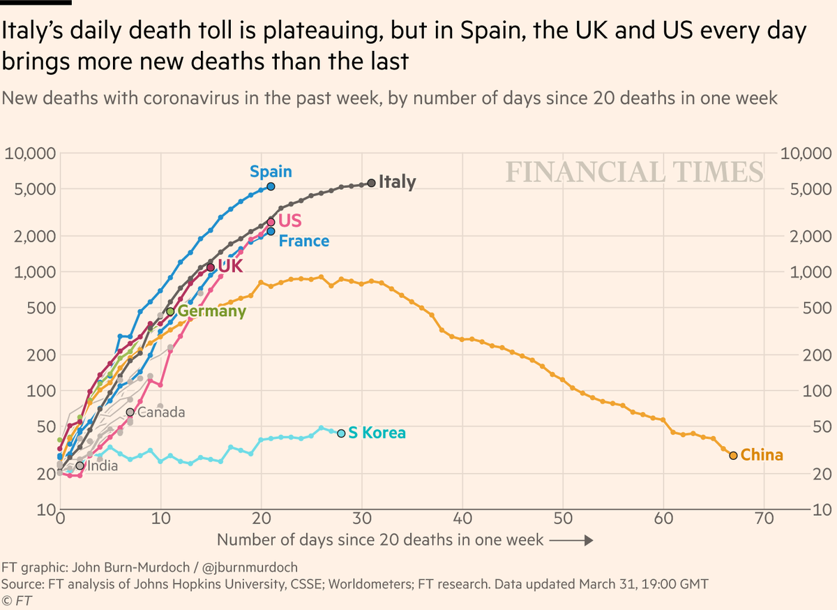
Naturally, we’re looking at deaths too.
Here are rolling new weekly deaths by country:
• Deaths lag cases, but Italy close to turning the corner here too
• 1000s of new deaths each week in the US, and that weekly increase is accelerating. US still weeks from turning the corner
Here are rolling new weekly deaths by country:
• Deaths lag cases, but Italy close to turning the corner here too
• 1000s of new deaths each week in the US, and that weekly increase is accelerating. US still weeks from turning the corner
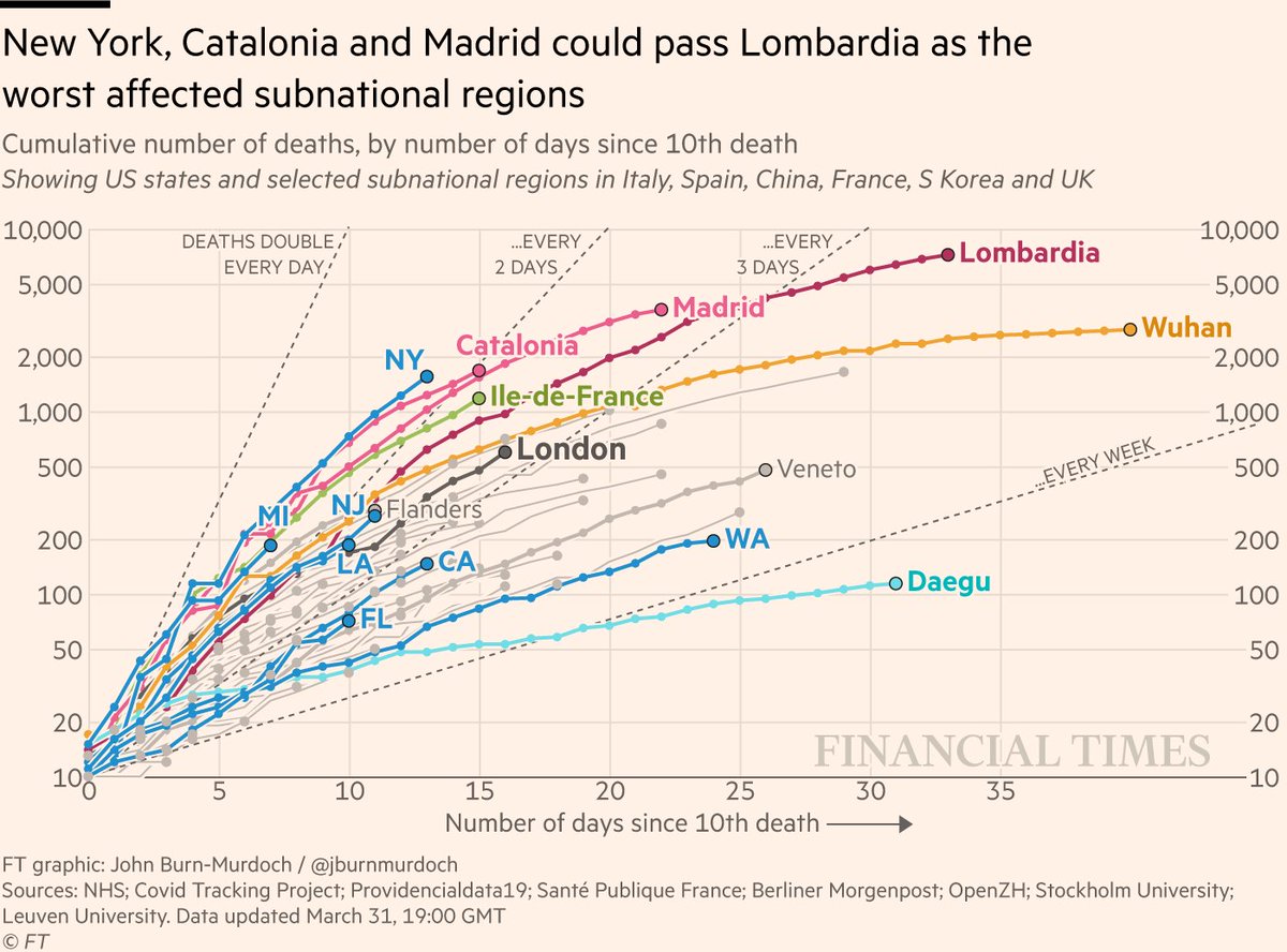
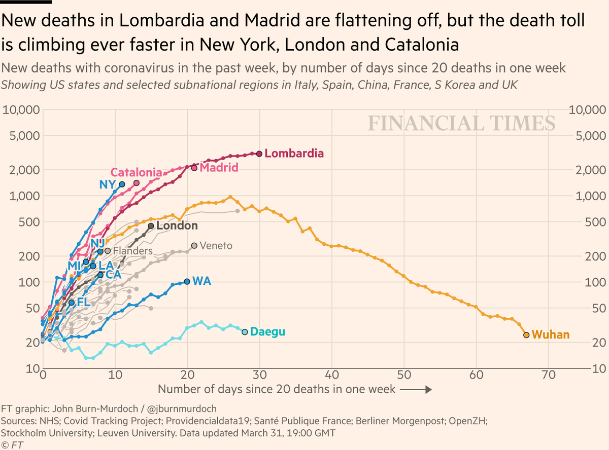
As before, the key units of analysis are subnational regions.
Lombardia and Madrid have suffered in recent weeks, but weekly death tolls are flattening off in both
New York and London are the new urban epicentres. Weekly death tolls accelerating and no turning point in sight
Lombardia and Madrid have suffered in recent weeks, but weekly death tolls are flattening off in both
New York and London are the new urban epicentres. Weekly death tolls accelerating and no turning point in sight
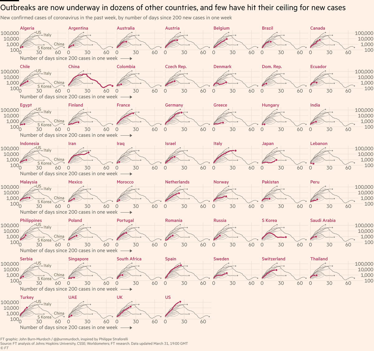
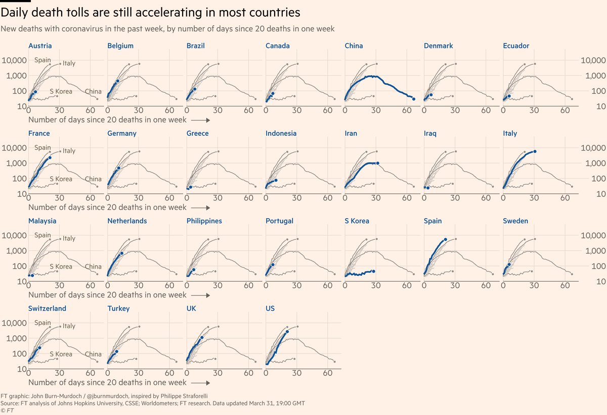
Of course, we still have the "small multiple" versions where you can trace your country’s path.
Are new cases still rising, or is the worst of the outbreak in the past?
Find out here:
Are new cases still rising, or is the worst of the outbreak in the past?
Find out here:
And here’s the same for deaths:
A huge hat-tip to @SimBarthelemy, who emailed me his suggestion a few days ago
If you have other thoughts on how we could improve our visual storytelling on coronavirus, email john.burn-murdoch@ft.com
And keep sending in that subnational data :-)
If you have other thoughts on how we could improve our visual storytelling on coronavirus, email john.burn-murdoch@ft.com
And keep sending in that subnational data :-)
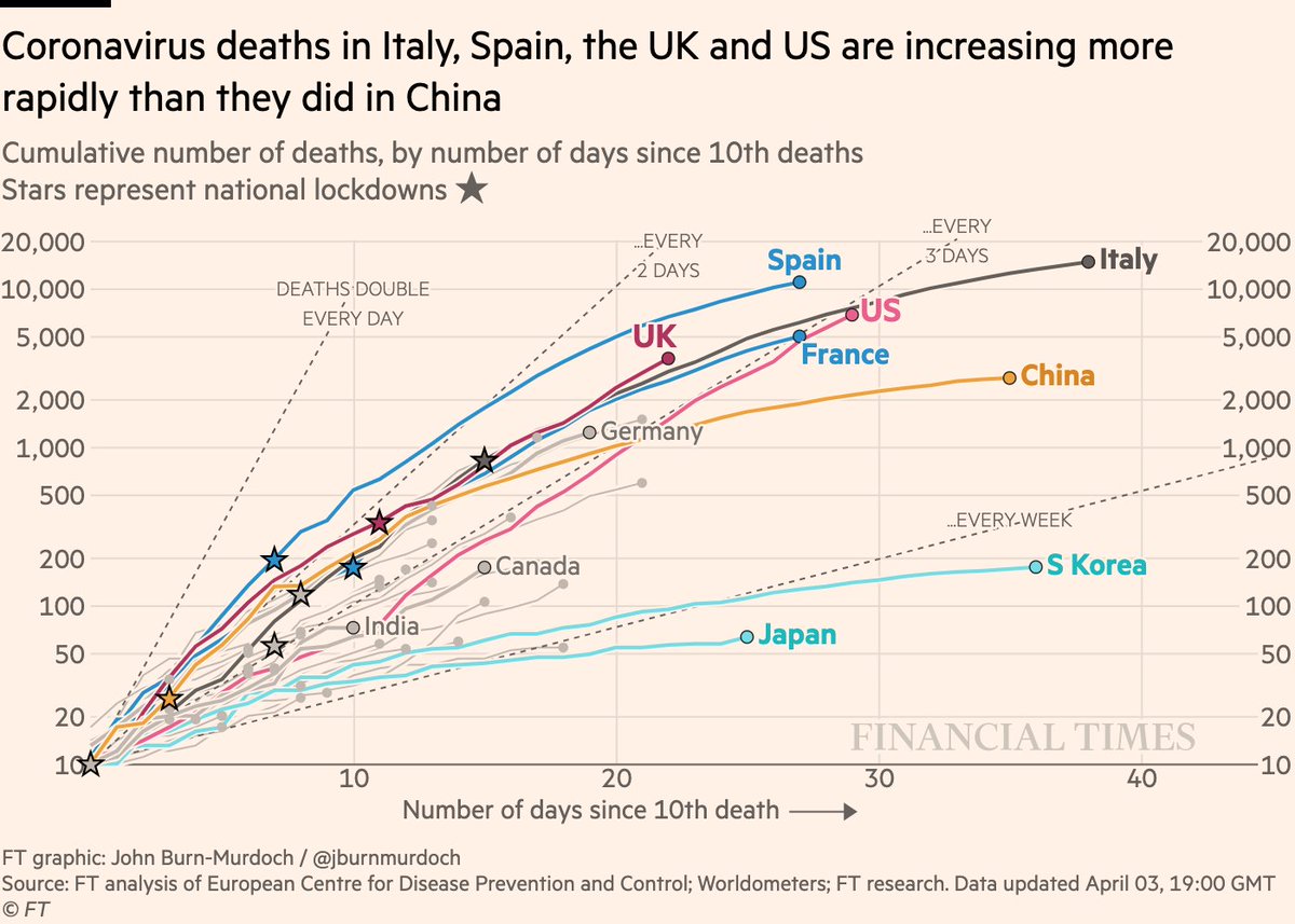
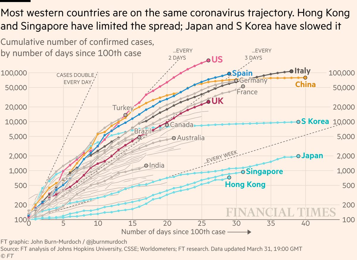
Turns out I’m easily persuaded:
Here are the original Coronavirus Trajectory Trackers™️, updated for tonight:
Cases continue to soar in the US. Might extend the y-axis on this one soon...
Here are the original Coronavirus Trajectory Trackers™️, updated for tonight:
Cases continue to soar in the US. Might extend the y-axis on this one soon...
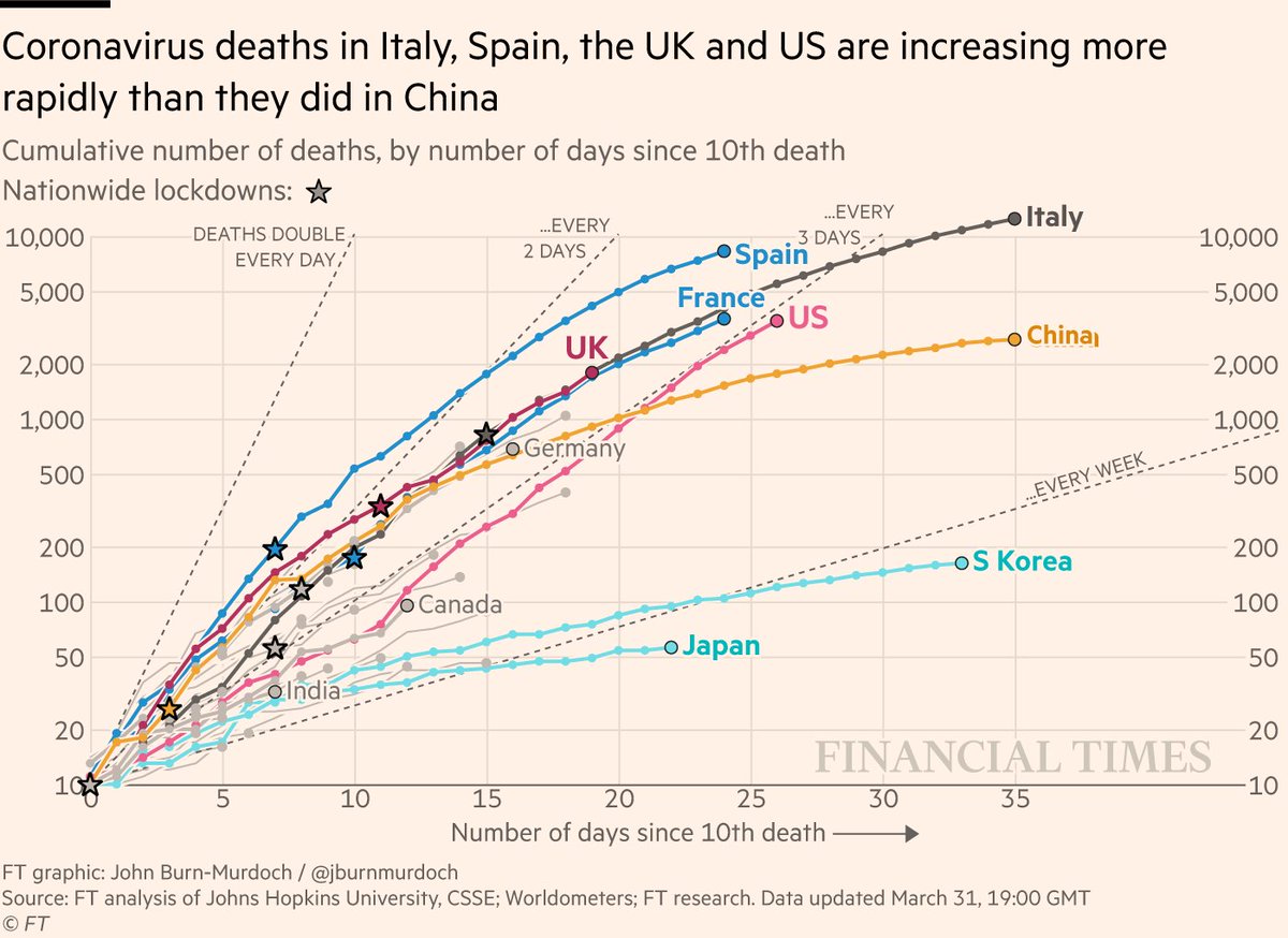
Here are deaths:
• US still hugging that "doubling every 3 days" line
• UK following directly in Italy’s footsteps
• US still hugging that "doubling every 3 days" line
• UK following directly in Italy’s footsteps
And deaths in subnational regions:
• New York still destined to become the new global epicentre
• New York still destined to become the new global epicentre