I tried to make a more nuanced #GeneralElection2019 map. It runs from blue (100% Conservative) via grey to red (100% non-Conservative, ie Lab + LD + SNP + etc).
The UK is more complex than the bright, bombastic, winner-takes-all maps show. Much of it is literally shades of grey.
The UK is more complex than the bright, bombastic, winner-takes-all maps show. Much of it is literally shades of grey.
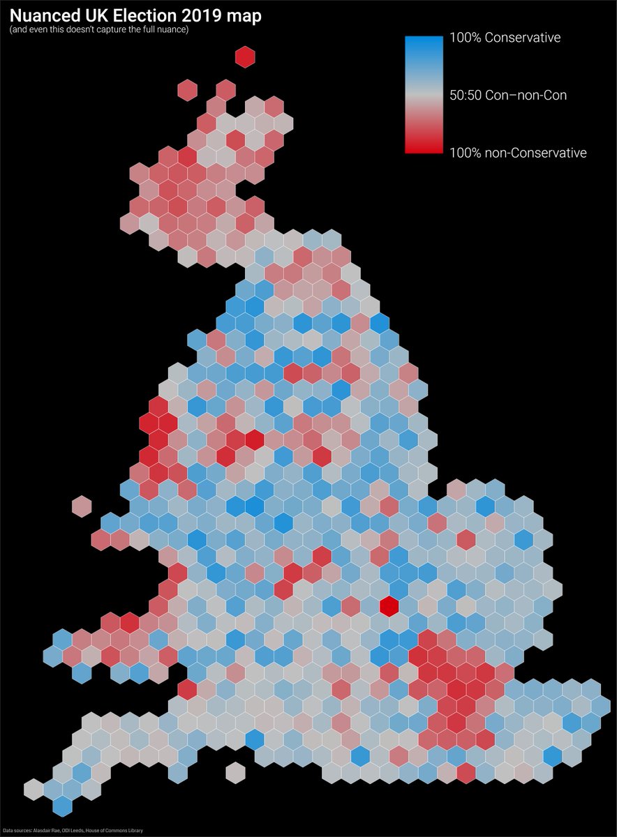
Obviously this still isn’t nuanced enough: ‘non-Conservative’ is a rather broad category, and I left off Northern Ireland which was just a bright red block given the lack of Tories there!
I was inspired to do this after making a similar map of the EU referendum. Maps of brightly-coloured regions were part of the toxic polarisation of that issue, with whole regions which were only 52:48 one way or the other labelled ‘leave’ or ‘remain’. Reality is again greyer.

With this election, while headlines focus on a massive landslide (which in reality is just over 10% of seats changing hands), the country is a mush of grey. All those complex, fascinating, sometimes-crazy opinions, swirling round, reduced to soundbites and narratives.
The election map didn’t entirely confirm my preconceptions: I was expecting it to be slightly greyer like the referendum one, and was surprised at the intensity of some blues and reds. (The localised bright reds are of course why the Tories needed the fewest votes per seat won.)
But, for deflated liberals, remainers, lovers of the social safety net and those of us simply baffled that anyone could vote for a racist, homophobic, womanising, lying, policy-vacuum fridge-hiding coward, look at how grey that map is and take some small comfort.
Unfortunately our electoral and parliamentary system means that that’s enough to ride roughshod over the majority of voters’ wishes, our constitution and more. But at least the views of the UK are a bit more complex than ‘WOO! GET IT DONE BORIS!!’
This will take time, and it will be exhausting, but you’re not alone.
We’ve got this.
Long live shades of grey in politics.
We’ve got this.
Long live shades of grey in politics.
OF COURSE I messed up the numbers a bit because I was tired and politically discombobulated today. The map should actually be slightly redder than shown, and you can find the corrected (and mildly interactive) version on my blog: andrewsteele.co.uk/blog/2019/12/n…