Good morning followers, new and not-new! After the flux of newcomers this weekend, I thought I’d introduce a little bit more about me + my journey so far to becoming a scientific/data illustrator. Read within! ⬇️🧵🪞🔬👨🏻🎓 #bio #aboutme #art #artist #scientificillustration #sciart 


My name's Mark and I am super passionate about telling science stories with the power of visual media🎨 I love illustration, I learn best with visuals, and I am constantly looking for (er, doodling?) ways to make pictures say MORE than just "a thousand words” 😉 


I've always been drawn to art as a kid. Ever since I could hold a pencil, I've been creatively engaged. Growing up I was discouraged from pursuing art (who wasn't?) and so I gradually developed an interest in science. Natural History is my favourite subject. 🌐🪱🐒🦀🦩🍄🪸🪐✨
Fast forward⏭️ I got my first degree at McMaster University @McMasterU in the Arts and Science Program @MacArtsci in 2013👨🏻🎓 Despite the name, it wasn't until my final year when I began merging my interests: I wrote (and drew!) a dissertation on the intersections of art + biology 


I then pursued a MSc in #Geochemistry and #Astrobiology, also at @McMasterSEES👨🏻🎓I got to work with the amazing folks at @NASAAmes on the @PavilionLake Project! My thesis was about carbon isotope biosignatures in #microbialite✨ - which I later made a comic about! #geochem 


Special shout-outs to @DSSLim, @allysonlbrady and @subsurface_life - amazing #WomenInSTEM who deserve big praise + thanks for their guidance + influence. Lots of fond memories from this time 🫶🏻🧪🚀 #stillgrateful #formativeyears 


Here is where I developed most of my science chops, and - many here might sympathize with this😜 - discovered the monotony of reading articles. How much simpler could understanding chemistry be if we just had (better) visuals?! #AcademicTwitter #isotopesareweird
Identifying these hurdles in my own studies is where I found the calling to prioritize my creative/artistic skills into science. I graduated + then enrolled in the University of Toronto's @MScBMC Program in 2015. It was very bio-focused, but here are some projects from that time: 


My thesis here was crafting an animated patient education program for #kidneytransplant recipients. It is a resource for visually communicating #transplant care. I'm still working on it, 7 years later! #hustle 


After graduating in 2017, I freelanced a bit before being whisked away to Stockholm 🇸🇪 I fantasized about living in Sweden since a teen, so meeting @AnnelieseMay at the @AMIdotorg conference in Austin TX was a windfall. She hired me for my first ever job! #starsaligned 🌠💼✈️ 


I worked as a multimedia designer + illustrator for a multinational healthcare project with @karolinskainst. These were halcyon days - what a privilege and an experience to live there. I learned so much and was deeply impacted💛💙 saknar det mycket. tack för allt o ses snart 


I returned to Canada in Summer 2019 and started working at @INVIVOCom @_rednucleus, an amazing studio creating gorgeous visuals for pharma and med companies. It's also where I worked with fellow BMC alumni + sciartists @azuravesta, @lisauiq + @GlendonMellow as well! 🟢🔵🟡➡️🔴 


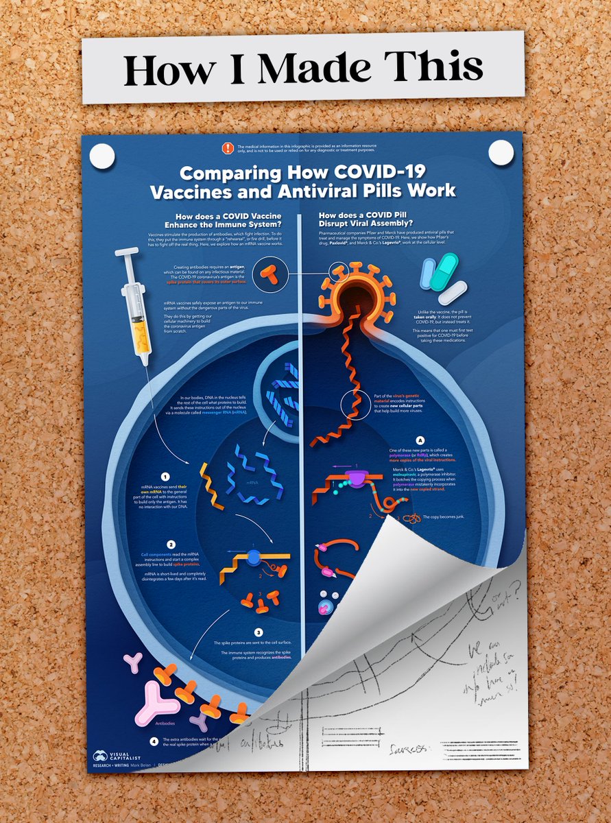
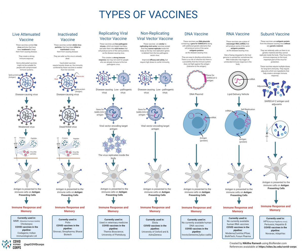
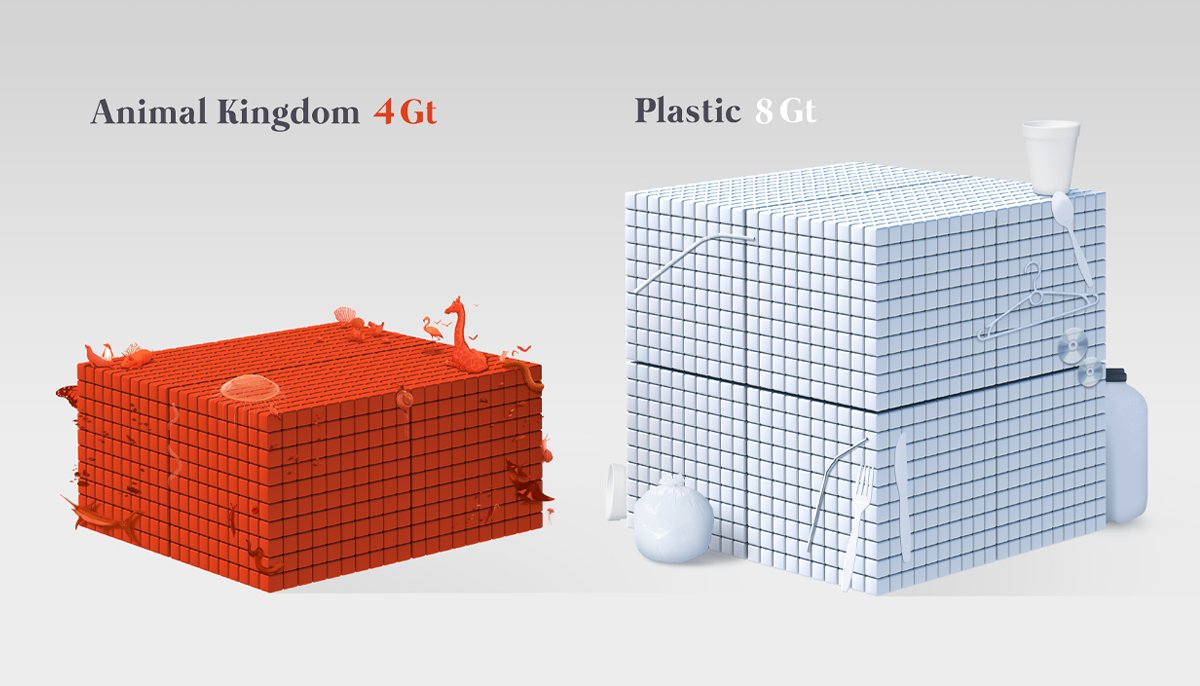
In 2021, I started working at Vancouver's @VisualCap as a Visual Scientific Communications Specialist 🔬🎨👨🏻💼 I'm so happy to be a part of the team and to be crafting science stories for the masses with engaging, impactful visuals. Here’s some of the story so far: 


Aside from the day job, I also freelance for scientists and their research publications🔬📚📔 Here are some graphics I made for #NASA, #NYBG, and other institutions in the past few years! Of course I did my own illustrations for my own science paper, too! #research 


My hopes for the future are many, but first + foremost is building an identity around my approach to storytelling🏗️📖 I want to refine this + work more closely with scientists/researchers, and I want to make people appreciate science in the way I see it🔭 


I have a long way to go and just getting started!🏁💪🏻 Thank you so much for following me! Be sure to stay tuned for more👀 You can keep up with my ventures here, or on Instagram (@ArtsciStudios) or Visual Capitalist: visualcapitalist.com/author/markb/
• • •
Missing some Tweet in this thread? You can try to
force a refresh


