,
13 tweets,
6 min read
Read on Twitter
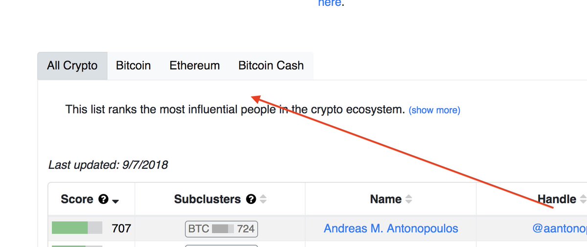
Funny that you’d say that @balajis… we just designed a new algo. It calculates influence scores for individual tweets.
Here is the prototype: docs.google.com/spreadsheets/d…
(it's the list of the most influential tweets in Bitcoin Twitter in the last 72h)
Here is the prototype: docs.google.com/spreadsheets/d…
(it's the list of the most influential tweets in Bitcoin Twitter in the last 72h)
The scores for individual tweets are going to be available via API. One can query it for a score of a given tweet for any of the clusters we track. We will also provide influence half-life time of each tweet.
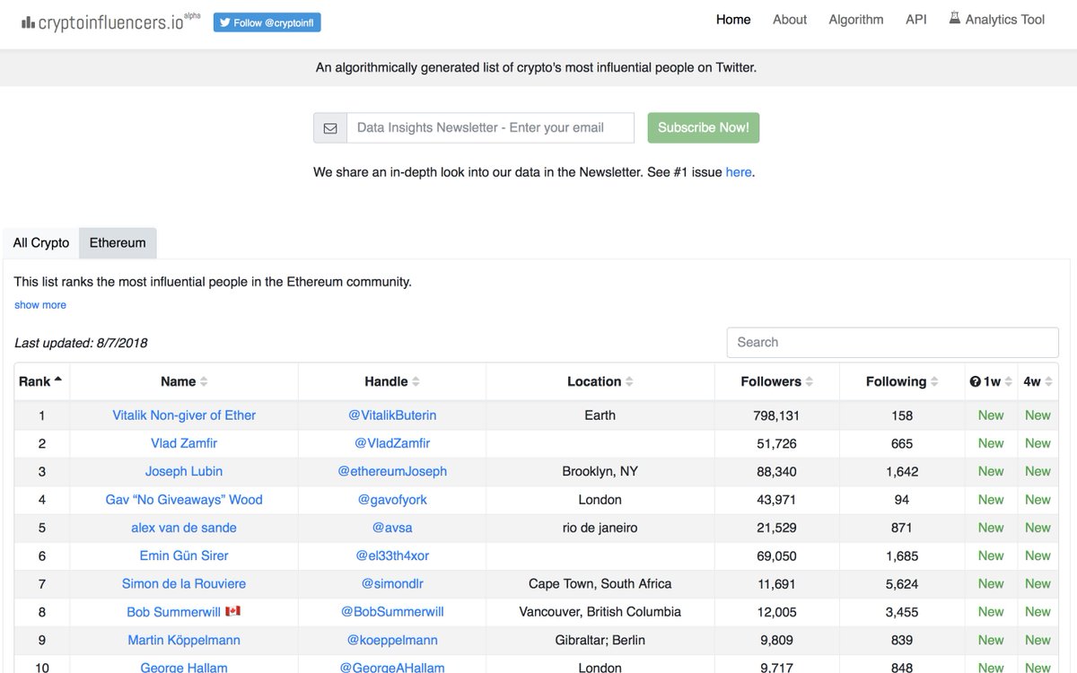
Spot on @nikillinit! This is the reason we decided to start with Bitcoin/Crypto ecosystems. More information flows through digital channels and in public in these groups. But many other networks are following suit.
Finding the opinion leaders is just the tip of the iceberg. Here are some other things we think this enables:
Identifying the most influential (also trusted vs. mistrusted) media outlets in a given group.
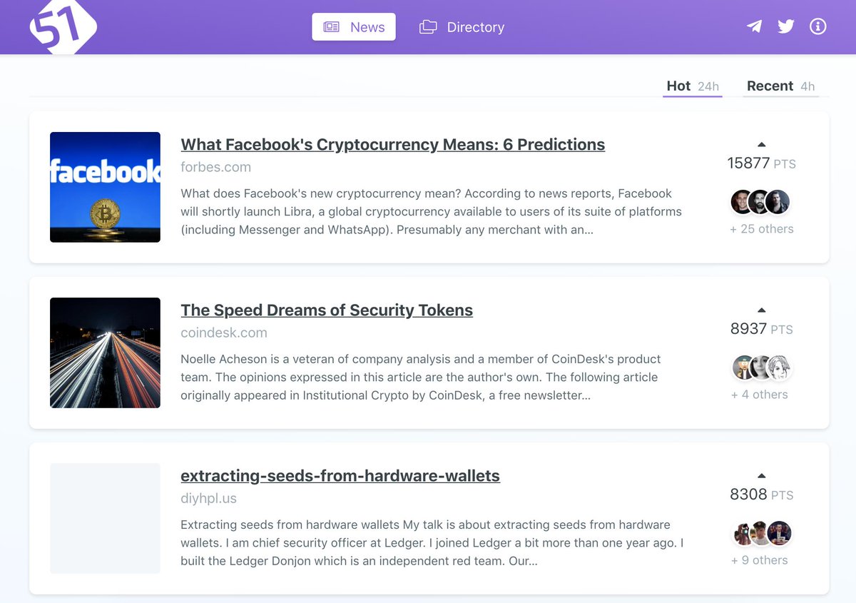
@fiftydotone recently created a cool feature: they show the most popular articles in crypto. With our data they could break it down for each cluster and show the change over time.
@fiftydotone recently created a cool feature: they show the most popular articles in crypto. With our data they could break it down for each cluster and show the change over time.
Quantifying buzz around podcast episodes or events. It can be done by looking at the influence of conversations.
E.g. recently people were tweeting from @breakingbitcoin. The sum of influence of tweets with #breakingbitcoin is a good indication of buzz around the event.
E.g. recently people were tweeting from @breakingbitcoin. The sum of influence of tweets with #breakingbitcoin is a good indication of buzz around the event.
Building a sentiment analysis tool that actually works. Understanding a sentiment of a statement is not enough. One also needs to know:
1) which cluster(s) the author belongs to
2) how influential he/she is in that cluster
3) what’s the relationship of this cluster to others
1) which cluster(s) the author belongs to
2) how influential he/she is in that cluster
3) what’s the relationship of this cluster to others
Mapping a subculture. Red meat, CBD oil and guns don’t have anything to do with Bitcoin. And yet they do.
To get the *feeling* for this you need to immerse yourself in this world. Or apply a Bag of Words algo to the list of the most influential tweets in a given cluster.
To get the *feeling* for this you need to immerse yourself in this world. Or apply a Bag of Words algo to the list of the most influential tweets in a given cluster.
Measure reception of announcements of projects.
@_JustinMoon_'s tweet about his coding for Bitcoiner’s project ranked #1 (the last 72h in Bitcoin Twitter). This is a strong indication of whether this project is considered as valuable by this group.
@_JustinMoon_'s tweet about his coding for Bitcoiner’s project ranked #1 (the last 72h in Bitcoin Twitter). This is a strong indication of whether this project is considered as valuable by this group.
Get a feeling whether a new direction is accepted or disapproved by a group.
@PeterMcCormack's announcement of going “Bitcoin-only” with his podcast ranked #5.
Other people tweeted about this move as well (yay/nay); these can also be measured.
@PeterMcCormack's announcement of going “Bitcoin-only” with his podcast ranked #5.
Other people tweeted about this move as well (yay/nay); these can also be measured.
Here is a clear example of Bitcoin Twitter disapproving of suspending @BtcpayServer account. @bitstein's tweet ranked #4.
And here is an example of popularity of a given podcast episode. @stephanlivera's tweet announcing new episode ranked #8.
Here is an example of mass coordination. A group continuously refines signals that it accepts or resists. @Excellion identified 4 to be resisted. The influence of this tweet (#9) indicates that its largely accepted by the group.