One of the major advances in our understanding the craftmanship of Kufic Qurans is the word done by Alain George on the Geometry of Kufic Qurans. The main two articles on this are readable online:
academia.edu/2643185/The_Ge…
academia.edu/2643183/The_Ge…
academia.edu/2643185/The_Ge…
academia.edu/2643183/The_Ge…
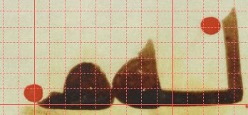
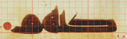
This photo essentially tells you all you need to know. The Quran of Amajur follows a strict geometrical grid. Every line is strictly 9 pen-strokes high; and these 9 penstrokes form the grid that dictate all proportions. 

The 'doubled' letters, dāl (ḏāl), kāf, ṣād (ḍād) and ṭāʾ (ẓāʾ) are almost exactly two penstrokes high, leaving only a tiny bit of room between the two lines.
The 'serif' of the dāl reaches just past the third interline. The shape of the initial ʿayn towards the fourth.
The 'serif' of the dāl reaches just past the third interline. The shape of the initial ʿayn towards the fourth.

The ʾalif goes up to the 6th gridline, and then its "horn" reaches the 7th. The lām follows this pattern too.


The wāw reaches just past the third interline, it's lower curve reaches one line below the baseline. (it reaches up to the second if it connects with a preceding fāʾ/qāf, and also descends further down in that case).


The hāʾ is almost exactly 4 interlines high.
Can you figure out even more rules that govern the style of the Amajur Quran? Try it for yourself; The document is beautifully digitized.
cudl.lib.cam.ac.uk/view/MS-ADD-01…
Can you figure out even more rules that govern the style of the Amajur Quran? Try it for yourself; The document is beautifully digitized.
cudl.lib.cam.ac.uk/view/MS-ADD-01…
This incredible precision led George to propose that the writers used a 'grid template' below their parchment, which, when it was just prepared must have been quite transparent.
The fact that the recto and verso are perfectly aligned also attests the original transparency.
The fact that the recto and verso are perfectly aligned also attests the original transparency.

That such a grid played a role for the classical Kufic styles (Kufic C and especially D), or at least the best executed ones seems clear.
But, while I was looking into this, I started to wonder: How detailed would this underlying grid have to be, to be able to adhere to it?
But, while I was looking into this, I started to wonder: How detailed would this underlying grid have to be, to be able to adhere to it?
Many of these proportions are actually bound by the physical properties of the pen: The baselines is of course always going to be 1-interline high, because that's what we define it by. Idem for the 'doubled' lines 2-interlines high.
Creating a loop as tight as possible with the same thickness of the pen, would automatically cause the wāw, fā/qāf and mīm to be three interlines high.
The minimum size of the hāʾ with its two eyes would indeed also require exactly 4 interlines. One wouldn't need to draw those.
The minimum size of the hāʾ with its two eyes would indeed also require exactly 4 interlines. One wouldn't need to draw those.
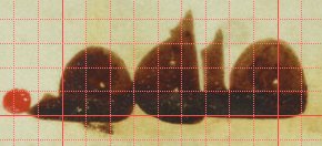
Only the ascending ʾalif/lām and the descending nūn would not come naturally from the shape of the letters. And it is indeed here that we actually find some amount of variation even in the Amajur Quran. Notice that in the sample page, the two lāms have different heights.

It seems to me then that the scribes probably only used a grid that expressed the baseline to stick to these proportions (and the image of George implicitly seems to agree with that).
But I would be very interested to hear what @joumajnouna has to say about this!
But I would be very interested to hear what @joumajnouna has to say about this!
Next time we will look to what extent this grid system can be applied to other (seemingly earlier) Kufic Styles, especially A, B and O.